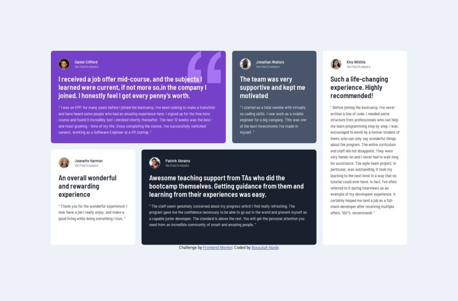
Design comparison
Solution retrospective
proud that i was able to use my knowladge about css grid for the desktop layout
What challenges did you encounter, and how did you overcome them?i had challanges applying the correct Css grid rules that i only knew by theory, but this challenge was helpful to implement and deepen that knowladge
What specific areas of your project would you like help with?how to determine an apporpriate breakpoint
Community feedback
- @MelissaZhuuPosted 9 months ago
I think the breakpoints you've chosen work pretty well! Sometimes, if the content is starting to look too small or too wide at the edges of a breakpoint, I like to set min and max widths to make it not stretch/shrink too much and still look nice. Also, just something I noticed, at 1100px - 1200px, the text for some cards cut off at the bottom, so maybe that's something to look into? Great job otherwise!
1
Please log in to post a comment
Log in with GitHubJoin our Discord community
Join thousands of Frontend Mentor community members taking the challenges, sharing resources, helping each other, and chatting about all things front-end!
Join our Discord
