Design comparison
Solution retrospective
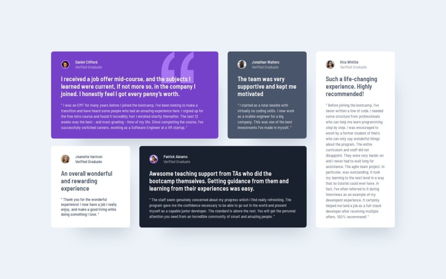
I'm most proud of successfully implementing the responsive CSS Grid layout across different screen sizes in a way that feels cohesive and visually appealing. Achieving this balance made the design look good on both mobile and desktop devices, and I also learned more about CSS custom properties for theming, which added to the overall quality of the project.
What challenges did you encounter, and how did you overcome them?I’d focus on refining the mobile-first workflow even further and experimenting with CSS animations to add some subtle interactivity to the testimonials.
What specific areas of your project would you like help with?I'd love to get feedback on optimizing my CSS code for performance and perhaps learning more about advanced CSS techniques for better control over grid positioning and responsive typography. Any advice on these areas would be very helpful!
Join our Discord community
Join thousands of Frontend Mentor community members taking the challenges, sharing resources, helping each other, and chatting about all things front-end!
Join our Discord
