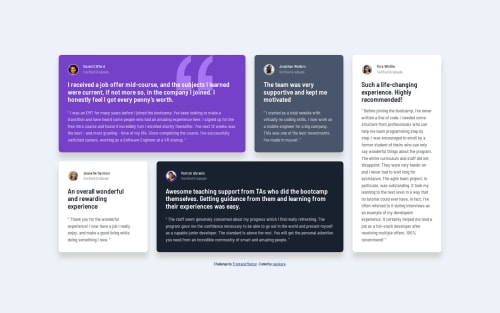
Design comparison
Solution retrospective
I'm proud of getting the solution done and making the grid layout responsive to different screen sizes.
What challenges did you encounter, and how did you overcome them?This project pushed my knowledge about CSS Grid and I learned a lot about grid template and grid area during the challenge. I recommend this video to anyone struggling with CSS Grid: Learn CSS Grid - A 13 Minute Deep Dive
What specific areas of your project would you like help with?Any tips about CSS Grid or general code quality are welcome!
Community feedback
- @gmagnenatPosted 5 months ago
Hi, congrats for completing the challenge! 🎉 It looks very good !
I checked your repo and I can give you a few comments on your code.
Does the solution include semantic HTML?
- a main landmark wraps the entire content
- the content is well structured
- images have an alt
Is it accessible, and what improvements could be made?
- it is recommanded to use relative units for media queries
- pixels should not be used for anything related to fonts. (font-size, letter-spacing, line-height, ...)
Some ressources:
- Building responsive layouts learning path
- More infos on accessibility for media queries
- More infos about fonts and pixels
Is the code well-structured, readable, and reusable?
I like the way you organised your code it is very readable and digest with the variable names. The import of css file in your main.scss looks a bit strange to me. I'm not 100% sure about it but I would refactor these files to be scss files too and then compiled into your main.css file all together.
Interesting point how you handled color lightness with
transparentize
I didn't know about that. An alternative could be to use the scss:color module and the scale functioncolor.scale(#e1d7d2, $lightness: 30%);
You could maybe improve card-light-text and card-dark-text in one single mixin using
lightness
of the color module again. Pass the background to your mixin and set the text colors based on the background lightness.Does the solution differ considerably from the design?
The solution looks quite close to the original design. good work on that ! 👏
I hope my review brings you something valuable. Don't hesitate to reach out if you have any questions.
Happy coding !
Marked as helpful1@nanikore0Posted 5 months agoHi @gmagnenat thank you for your feedback!
I have made changes in my code that you pointed out regarding relative units for media queries and fonts. I've also changed the index.scss to use partials instead of importing from a separate css file and improved the
card-light-text
andcard-dark-text
in a single mixin calledtransparent-text
that takes a color as an argument.It's very interesting your approach of taking the background color as an argument for the mixin and using
color.scale
and$lightness
when changing the text opacity, I haven't thought about doing it this way. But I ended up usingtransparentize
for thetransparent-text
mixin because I feel like it's easier to work with since we're making the text transparent, but it's also nice to learn about thecolor.scale
module that I didn't know of. I'm new to SASS in general so tips like this is greatly appreciated and I'll keep in mind for future projects.If you have the time to revisit my code I would appreciate it :)
Again, thank you for your feedback! I appreciate that you took your time to look at my code. This review was very insightful and I learned a lot thanks to it! 🙏
1
Please log in to post a comment
Log in with GitHubJoin our Discord community
Join thousands of Frontend Mentor community members taking the challenges, sharing resources, helping each other, and chatting about all things front-end!
Join our Discord