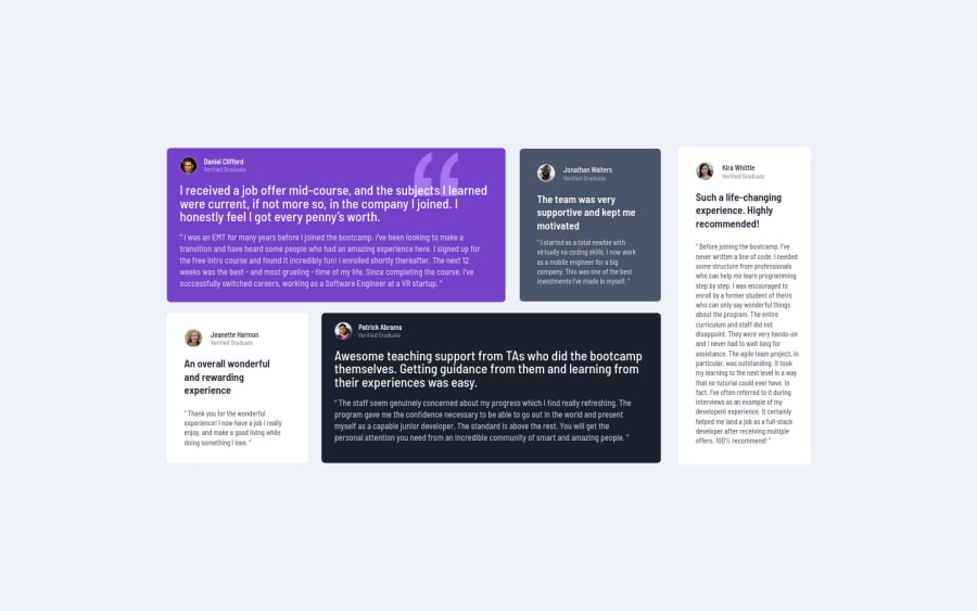
Design comparison
SolutionDesign
Solution retrospective
give me your opinion
Community feedback
- @VCaramesPosted almost 2 years ago
Hey there! 👋 Here are some suggestions to help improve your code:
- For the testimonials, it is best ✅ to to wrap each individual testimonial component in a
figureelement, the individuals information should be wrapped in afigcaptionelement and lastly, the testimonial itself should be wrapped in ablockquoteelement.
Code:
<figure>
   <figcaption></figcaption>
   <blockquote></blockquote>
</figure>
More Info:📚
- Why use this (it usually
10px)? NEVER ❌ do this as it creates accessibility issues for users and it is outdated, instead download apxtorem/emconverter in your code editor.
html { font-size: 13px; }- Implement a "Mobile First" approach 📱 > 🖥
Mobile devices are now the dominant 👑 way in which people browse the web, it is critical that your website/content looks perfect 💯 on all mobile devices.
More Info: 📚
If you have any questions or need further clarification, feel free to reach out to me.
Happy Coding! 🎆🎊🪅
Marked as helpful0@Mostafa-ninooPosted almost 2 years ago@vcarames at first thanks for helping. about mobile you mean that I have to do mobile first then I make the laptop 1440px by media query?
1@VCaramesPosted almost 2 years ago@Mostafa-ninoo
Glad I could help!
That is correct ✅!
0 - For the testimonials, it is best ✅ to to wrap each individual testimonial component in a
Please log in to post a comment
Log in with GitHubJoin our Discord community
Join thousands of Frontend Mentor community members taking the challenges, sharing resources, helping each other, and chatting about all things front-end!
Join our Discord
