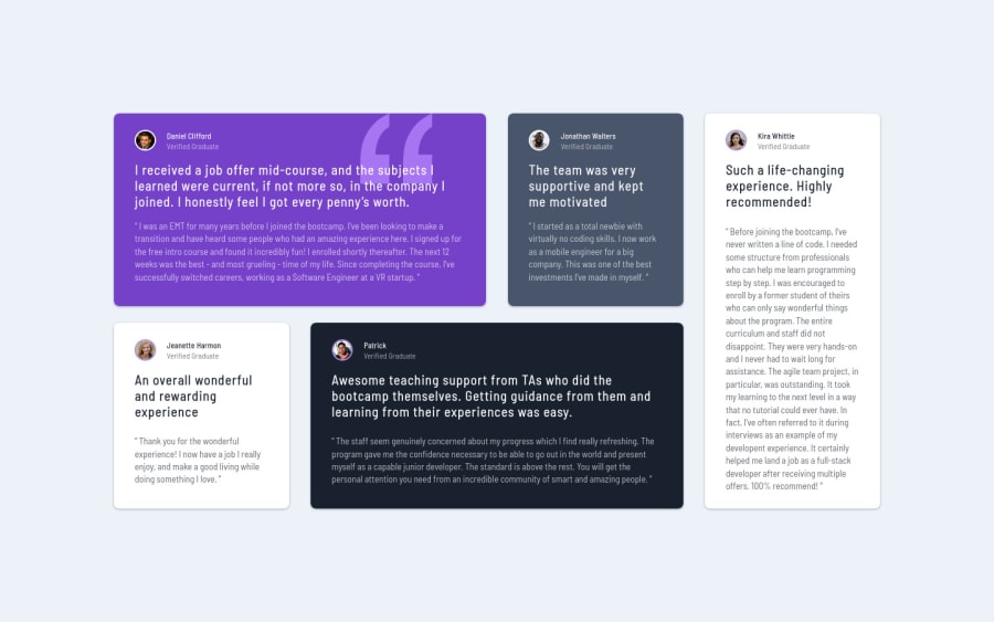
Testimonials Grid Section (SASS + Responsive + Grid Layout)
Design comparison
Solution retrospective
Hi there 👋, I’m Melvin, and this is my solution for this challenge. 🚀
🛠️ Built With:
- SASS. 🎨
- Gird layout. 📏
Any suggestions on how I can enhance this solution or achieve even better performance are welcome!
Thank you. 😊✌️
Community feedback
- @correlucasPosted about 2 years ago
👾Hello @MelvinAguilar, congratulations on your new solution!
I’ve some suggestions for you:
1.You’re in the right track I can see that you’ve used the majority semantic tags possible for this challenge, the only block you’ve missed is the paragraph containing the
quote text
you can improve the accessibility there using<blockquote>
to indicate to screen readers that the content inside that paragraph is a quote.2.Its amazing that you’ve customized some interaction, you’ve to pay attention because when you add some
hover effects
you've to think that for the mobile version there's an issue that the elements with hover getstuck
on the active state of the hover until you click on something else. Something you can do to avoid this problem on mobile, the stick hover, is to add a media query saying that you want hover effects only on devices that are nottouch
. So you can use:@media (hover: hover) { {ADD HERE ALL THE CLASSES WITH HOVER EFFECTS TO DISABLE IT ON MOBILE} }
✌️ I hope this helps you and happy coding!
Marked as helpful1@MelvinAguilarPosted about 2 years ago@correlucas Thanks for taking your time to review my solution !.
I already use a media query for solving sticky hover states:
@media (hover: hover) { .testimonial:hover { box-shadow: ... } }
but maybe I have not put into practice some concept. Is this correct?
Thanks for the feedback!
0 - @truong231298Posted 8 months ago
@MelvinAguilar Your decision-making and problem-solving skills are incredible. your design is so beautiful and easy to understand. you have great work!
0 - @cvalencia1991Posted about 2 years ago
Great work on your project, you should put your project in GitHub to be Live to see the other things that need to fix, also you should use Figma to re-create the project and more precisely the widths and heights.
0@MelvinAguilarPosted about 2 years ago@cvalencia1991 Thank you very much for your comment
Here is the link to the repository on GitHub: Testimonials Grid Section (MelvinAguilar).
You can find the links to the repositories in the upper section of the solutions.
0
Please log in to post a comment
Log in with GitHubJoin our Discord community
Join thousands of Frontend Mentor community members taking the challenges, sharing resources, helping each other, and chatting about all things front-end!
Join our Discord