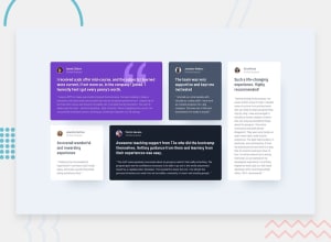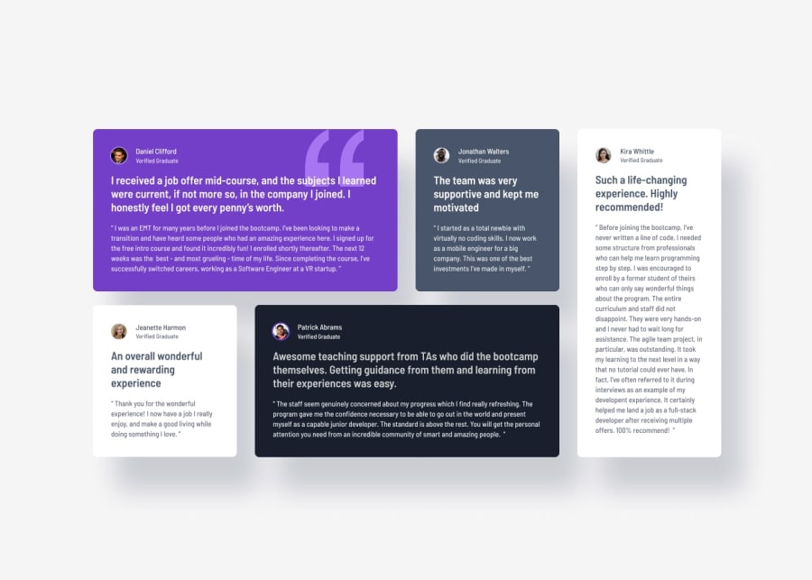
Design comparison
Solution retrospective
I think I came pretty close. Some letter spacing or a font-size here or there might be slightly off, but other then two my major flaws, I should have gotten it mostly right.
What challenges did you encounter, and how did you overcome them?My two biggest problems where:
1.) The size of the cards and how they are exactly ordered and spaced out on the grid in the MockUp. If you look at the very bottom of my CSS-file you can see my grid area for the desktop view using an excessive amount of colums and rows. However, that was my only solution to get the size and spacing of the cards as close as possible to the actual spacing and sizing of the MockUp.
2.) In the MockUp you can see that the paragraph of the card to the far right card (Kira Whittle) uses a slightly different gap size between it's headline and it's paragraph and is probably meant to adjust dynamically. I tried everything from grids to flex for that, but just could not get it to work for me.
What specific areas of your project would you like help with?Maybe someone knows a better solution to my two problems. Or if you notice anything else, please let me know.
Community feedback
- P@MukarramHaqPosted 11 months ago
Love it. Good job on this one :)
For your first problem:
I would suggest looking into how to span an element across different columns and rows. You can use the
grid-columnorgrid-rowwhich is the short hand forgrid-column-startandgrid-column-endAnother thing that really helped me with this project is using
grid-template-columnproperty. For this to work you need to figure out how many columns do you need in this project which is usually the most difficult thing to do if you are starting out. For that I would suggest drawing out the layout on a piece of paper and try to work out how many columns you need. I generally do not declare rows unless I really have to and for this project you just need to declare columns which you can usinggrid-template-columnlooking into it might be a good idea. This will save you a lot of headacheI hope this was helpful for you :)
Marked as helpful1
Please log in to post a comment
Log in with GitHubJoin our Discord community
Join thousands of Frontend Mentor community members taking the challenges, sharing resources, helping each other, and chatting about all things front-end!
Join our Discord
