Design comparison
SolutionDesign
Solution retrospective
What are you most proud of, and what would you do differently next time?
👋Hello Front-End Mentor Community! This is my solution for this challenge!
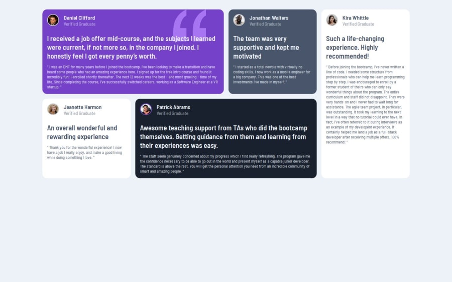
What challenges did you encounter, and how did you overcome them?🏋️I had to spend a lot of time on the grid and how to do it
What specific areas of your project would you like help with?✍️ Feedback welcome!
Community feedback
- @rafaeldgeoPosted 9 months ago
Hi @rembiszkacper Congratulation on your challenge! I believe that your problem with container be centralize it's because you didn't define the height for body and html, but only this don't solve. You can define flexbox into body, so your container will become one flex-item.
body { YOUR CODE... display: flex; flex-direction: column; justify-content: center; }
0
Please log in to post a comment
Log in with GitHubJoin our Discord community
Join thousands of Frontend Mentor community members taking the challenges, sharing resources, helping each other, and chatting about all things front-end!
Join our Discord
