Design comparison
SolutionDesign
Solution retrospective
What are you most proud of, and what would you do differently next time?
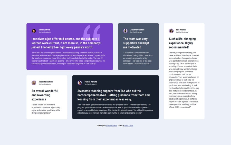
This is another redo of the testimonials grid section. It came out much closer to the design than the first time. I learned a lot about how to use grid and flexbox together to get the layout I wanted. I also continued to use custom properties for the colors, font sizes and spacing.
Please log in to post a comment
Log in with GitHubCommunity feedback
Join our Discord community
Join thousands of Frontend Mentor community members taking the challenges, sharing resources, helping each other, and chatting about all things front-end!
Join our Discord
