Design comparison
Solution retrospective
"I'll finish this project in three days. I used to overthink designs like this and not start on them. But now I have a process and will keep using it for my next project."
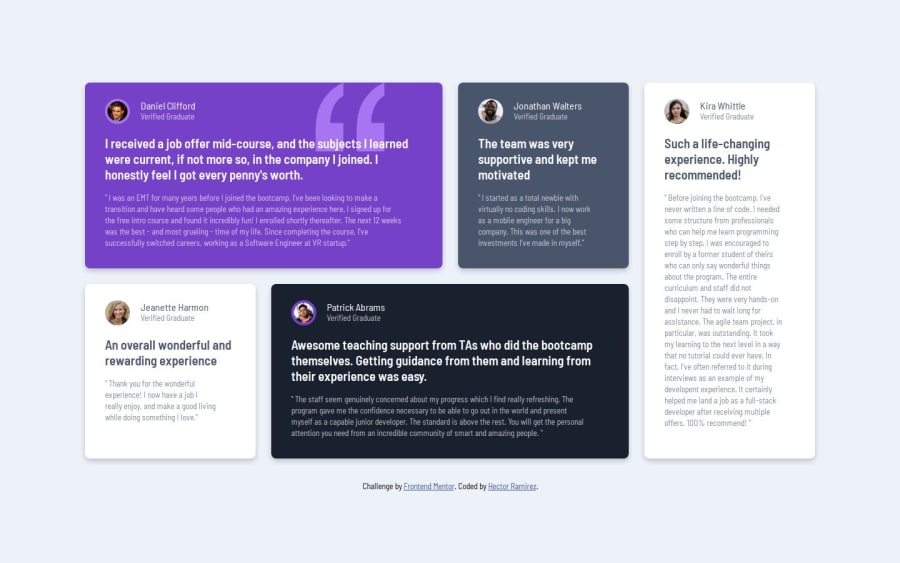
What challenges did you encounter, and how did you overcome them?I encountered difficulty in getting the cards to line up as I intended. After facing this setback, I watched instructional videos addressing this issue. I utilized the grid from the inspector tool and successfully aligned the cards properly.
What specific areas of your project would you like help with?Maybe how animations work. But using them more in my projects will help get me a better understanding
Community feedback
- P@makogeborisPosted 8 months ago
Hi hectorlil48 great work, consider adding a media query for the animation to reduce motion for users who might not prefer it. prefers-reduced-motion
@media (prefers-reduced-motion) {
.some-element {
    animation: none;
  }
}
Marked as helpful1 - P@catreedlePosted 8 months ago
The site looks beautiful and responsive on any screen size. I can always see the whole horizontal content of the page on any resize (I struggled with mine). It's cool that you added animation, but it's a bit dizzying when it shows repeatedly when I resize my browser around. Great job!
1
Please log in to post a comment
Log in with GitHubJoin our Discord community
Join thousands of Frontend Mentor community members taking the challenges, sharing resources, helping each other, and chatting about all things front-end!
Join our Discord
