Design comparison
SolutionDesign
Please log in to post a comment
Log in with GitHubCommunity feedback
- @DAJ350
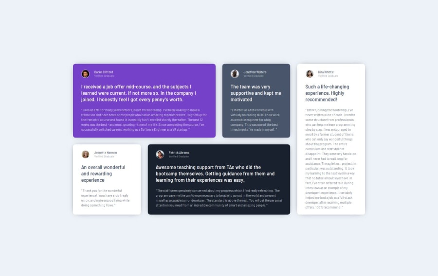
Hey, great job taking this coding challenge on. You done well getting your project to look as close as it does to the design.
If you decide to reattempt this challenge, I urge you to attempt implementing the background pattern in the purple card. You may want to take a look into properties such as the z-index, position and offset properties for it.
Nonetheless, great job and happy coding!
Join our Discord community
Join thousands of Frontend Mentor community members taking the challenges, sharing resources, helping each other, and chatting about all things front-end!
Join our Discord
