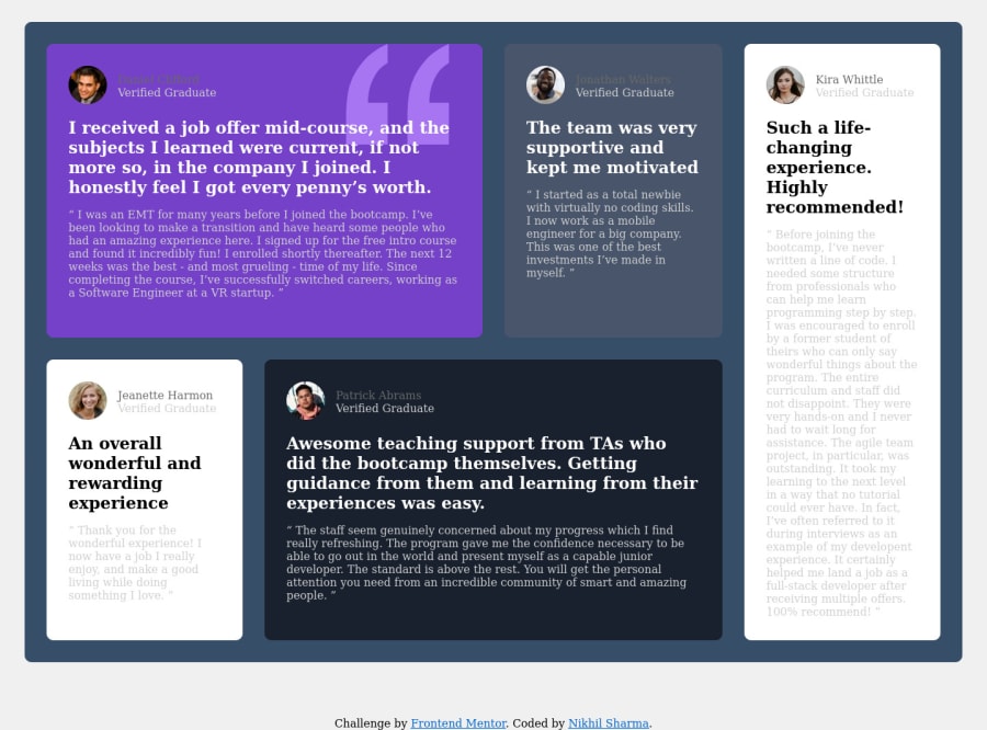
Design comparison
Community feedback
- @correlucasPosted about 2 years ago
👾Hi Nikhil Sharma , congrats for your new solution!
Great code and great solution! I did this challenge too and know how hard it is to set up this
grid layout. I think you've done a really good job building everything! Here's some tips for you:You've missed the color for the background, in this case is
background-color: #EDF2F8and add it to the body.You’re in the right track I can see that you’ve used the majority semantic tags possible for this challenge, the only block you’ve missed is the paragraph containing the
quote textyou can improve the accessibility there using<blockquote>to indicate to screen readers that the content inside that paragraph is a quote.✌️ I hope this helps you and happy coding!
Marked as helpful0
Please log in to post a comment
Log in with GitHubJoin our Discord community
Join thousands of Frontend Mentor community members taking the challenges, sharing resources, helping each other, and chatting about all things front-end!
Join our Discord
