Design comparison
Community feedback
- P@NikitaVologdinPosted 6 months ago
Hi @gakrita! I found a couple of ways to improve your testimonial section:
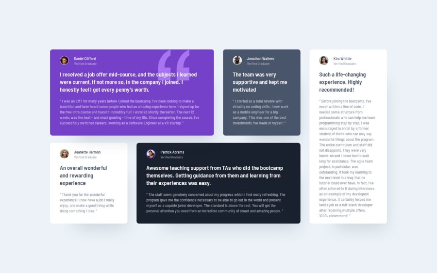
- Aligning the quotation mark image:
To move the quotation mark image next to the text in the testimonial, you can add a style called "relative" to the element with the class ".testimonial-1" (the dot "." means "class"). Then, for the quotation mark image itself, you can set styles called "top: 0" and "right: 24px". This will position the image at the top right corner of the testimonial box. Here's a helpful article to learn more about this: https://developer.mozilla.org/en-US/docs/Learn/CSS/CSS_layout/Positioning
- Making the testimonials responsive for mobile devices:
You've already done a great job with the mobile layout, but to ensure everything looks good on smaller screens, you can set a maximum width of 327 pixels for each testimonial box. A single CSS rule can be used to apply this style to all testimonial boxes at once. You can write something like: CSS
section div {
  max-width: 327px;
}
Here's a helpful article to learn more about this type of CSS selector: https://developer.mozilla.org/en-US/docs/Web/CSS/Descendant_combinator
Basically, this rule sets a maximum width of 327 pixels for every div element that's inside a section element on your page.
1
Please log in to post a comment
Log in with GitHubJoin our Discord community
Join thousands of Frontend Mentor community members taking the challenges, sharing resources, helping each other, and chatting about all things front-end!
Join our Discord
