Not Found
Not Found
Not Found
Not Found
Not Found
Not Found
Not Found
Not Found
Not Found
Not Found
Not Found
Not Found
Not Found
Not Found
Not Found
Not Found
Not Found
Not Found
Not Found
Not Found

Submitted

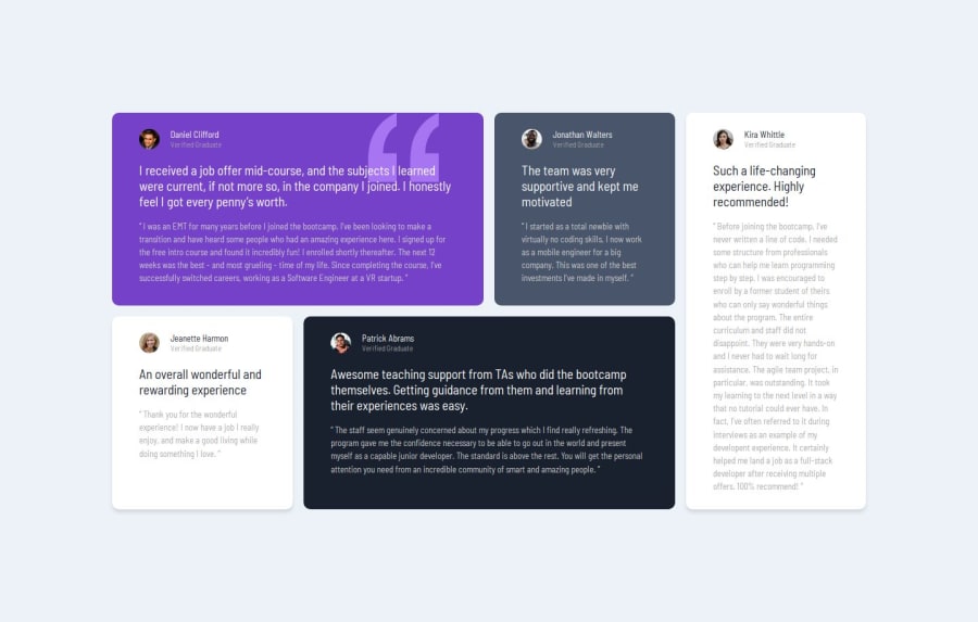
Testimonials Grid Section (mobile first using grid and flex)

P
AKdeBerg 160

@AKdeBerg

Desktop design screenshot for the Testimonials grid section coding challenge

This is a solution for...

  • HTML
  • CSS
2junior
View challenge

Design comparison


SolutionDesign

Solution retrospective


What are you most proud of, and what would you do differently next time?

I have implemented the desktop version using Grid and the mobile version using FlexBox. Using two types of layout methods boosts my confidence.

What challenges did you encounter, and how did you overcome them?

In desktop version, an item wasn't stretching all the way through the whole cell. Later I found a property called align-items: stretch which solves the problem.

What specific areas of your project would you like help with?

Box shadow is still challenging for me to apply. I can see the two white cards has some shadow, it's hard for me to apply. Anybody help me how to have that kind of shadow?

Community feedback

P

@grifano

Posted

Great job on structuring the testimonial section using the <article> tags—it really improves the semantic clarity! Just a couple of suggestions to make it even better:

  • Accessibility: Consider adding <header> tags for the card titles and using role="list" and role="listitem" for improved accessibility.
  • CSS Grid: Named grid areas could make your code more readable and maintainable, rather than relying solely on nth-child.
  • SEO & Performance: Implementing structured data for the testimonials could boost SEO, and using lazy loading for images might improve page speed.

Overall, it’s looking solid! Just a few tweaks, and it’ll be even more robust. 😊

Marked as helpful

1

P
AKdeBerg 160

@AKdeBerg

Posted

great help! thank u so much @grifano

0

@TedJenkler

Posted

Hi @AKdeBerg,

Nice project! I see you’ve put effort into accessibility, which is great. Here are a couple of tips for improvement:

ARIA Labels: When using div elements instead of semantic HTML, consider adding descriptive class names to aria-label="". This will enhance accessibility and a quick fix—just copy the class name into the ARIA label.

Font Weights: For an extra touch, you might experiment with font weights to get even closer to a pixel-perfect design. While not essential, it can help you achieve a near-perfect match with your screenshots.

Hope these tips are helpful!

Best, Teodor

0

Please log in to post a comment

Log in with GitHub
Discord logo

Join our Discord community

Join thousands of Frontend Mentor community members taking the challenges, sharing resources, helping each other, and chatting about all things front-end!

Join our Discord