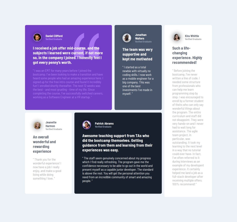
Design comparison
Solution retrospective
I’m proud of creating a responsive and visually appealing testimonials grid that works well on all devices. Next time, I’d plan the layout better, test on more devices, and add animations to make it more engaging. I’d also involve feedback earlier to improve the design.
What challenges did you encounter, and how did you overcome them?I faced challenges in making the grid fully responsive and ensuring perfect alignment across screen sizes. I overcame this by reading documentation and experimenting with different CSS techniques. Maintaining consistency in styling was another challenge, which I solved by organizing the code better and reusing styles effectively.
What specific areas of your project would you like help with?I’d like help with improving the responsiveness further, especially for smaller devices. I also want guidance on adding subtle animations to make the section more interactive and tips on optimizing the code for better performance.
Community feedback
- @huyphan2210Posted 2 days ago
Hi, @workdotnisha
I checked out your solution and I have some thoughts:
- Add subtle animations
Consider enhancing the user experience with animations on hover. For example, you could add effects to "items" or their titles. Look into CSS properties like
animation
,@keyframes
,transition
, andtransform
to achieve this.- Adopt a mobile-first approach
I noticed you’re using media queries for smaller devices. To improve responsiveness, why not start with smaller devices first and then scale up with media queries for larger screens? This "mobile-first" approach is widely recommended as it helps address smaller device issues before scaling up.
- Refine your breakpoints
Your media query breakpoint is set at
768px
. However, I noticed the layout experiences horizontal scrolling between769px
and985px
due to thepadding: 8rem
. This isn't user-friendly, as users have to drag the scrollbar. To fix this, either increase the breakpoint's upper limit or adjust the layout within this range for better usability.- Use semantic HTML
Avoid overusing
div
elements where more semantic tags could improve structure and accessibility. For example:.grid-container
could be a<main>
.- Each
.container
could be an<article>
. .profile
could use a<figure>
tag..detail
could be a<hgroup>
with titles inside as<h1>
or<h2>
.
This practice not only improves readability but also enhances accessibility.
- Improve CSS class naming
Naming classes like
item1
,item2
, etc., is not scalable. What if more items are added dynamically? Use descriptive names that convey purpose (e.g.,profile-card
,user-detail
). Scalable naming makes your code maintainable and reusable. Research CSS naming conventions like BEM (Block-Element-Modifier) for inspiration.
Hope this helps!
Marked as helpful1@workdotnishaPosted 2 days ago@huyphan2210 Thank you for your feedback. I will correct all these things.
1
Please log in to post a comment
Log in with GitHubJoin our Discord community
Join thousands of Frontend Mentor community members taking the challenges, sharing resources, helping each other, and chatting about all things front-end!
Join our Discord