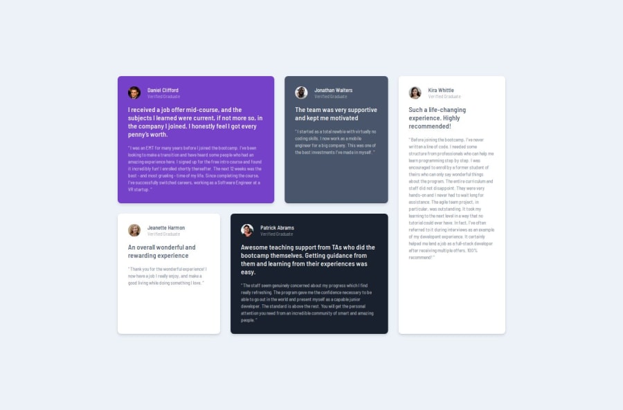
Design comparison
Solution retrospective
I'm proud of using grid effectively, it wasn't such an issue this time and im glad :)
What challenges did you encounter, and how did you overcome them?i had some trouble making the grid elements have the same width as the elements in the picture . i overcame them by tweaking the margin and padding of the grid container.
What specific areas of your project would you like help with?i just need your opinion and honest review :) thanks
Community feedback
- P@elCris99Posted 6 months ago
Hi, great work. The code seems well organized. As for the html, consider adding a value to the different "alt" in the <img>. As for the css, try to manage the layout with different media queries, in your case the cards are too narrow at some sizes. Finally, you could also add a max-width to the testimonial container, so they don't grow too much when the window size is too large. Hope you find some of this advices useful.
Marked as helpful1P@nimrodEDEPosted 6 months agoHi, thanks for your help :) I fixed the code . what do you think? @elCris99
0
Please log in to post a comment
Log in with GitHubJoin our Discord community
Join thousands of Frontend Mentor community members taking the challenges, sharing resources, helping each other, and chatting about all things front-end!
Join our Discord
