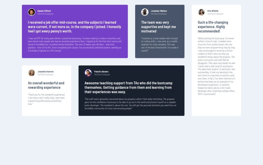
Design comparison
SolutionDesign
Solution retrospective
What are you most proud of, and what would you do differently next time?
I proud of my improve in my grid and git skills.
What challenges did you encounter, and how did you overcome them?I found the grid layout a bit challenging but was able to figure it out.
What specific areas of your project would you like help with?I would like to receive help in my responsive design because I feel that is one of the most important things in web design.
Community feedback
- @huyphan2210Posted 2 months ago
Hey Moises2710,
I checked out your solution and wanted to share a suggestion:
- On desktop and tablet views, the section doesn’t appear centered in the viewport. To fix this, you could set the <body> tag to have min-height: 100vh. Using min-height: 100vh ensures that the body takes up at least the full height of the viewport, even when content is limited. After that, you can apply Flexbox or CSS Grid to the body to center the section both vertically and horizontally.
Other than that, everything looks great! I hope this feedback is helpful.
0
Please log in to post a comment
Log in with GitHubJoin our Discord community
Join thousands of Frontend Mentor community members taking the challenges, sharing resources, helping each other, and chatting about all things front-end!
Join our Discord
