Design comparison
Community feedback
- @petrakowwwPosted 6 months ago
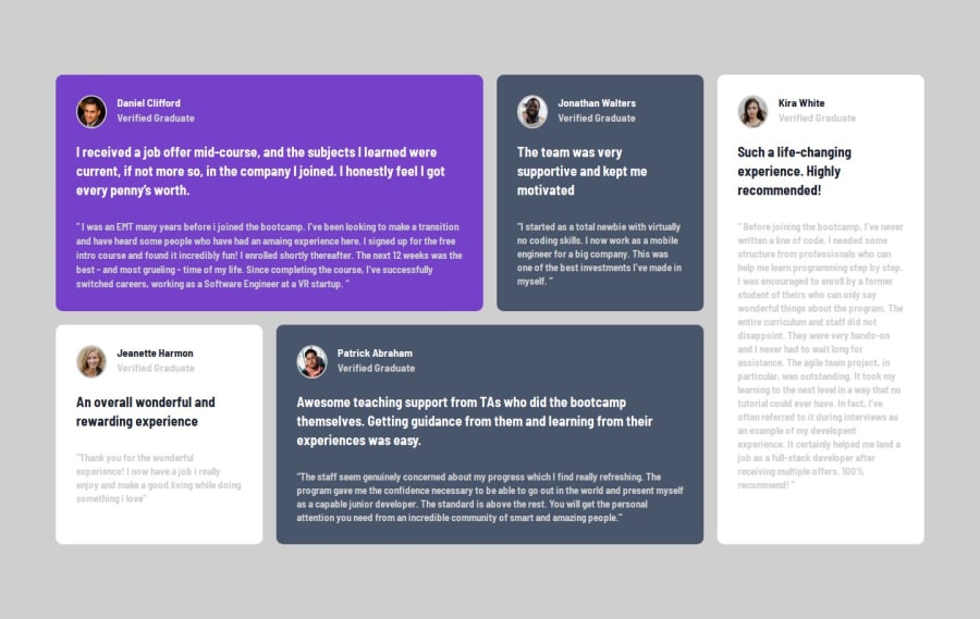
Hi, I've just looked at your work, well done, but I see obvious flaws in the choice of colors. For example, the background or text inside the cards. They should be changed, the color of the text of the cards is taken from the main header text and transparency is applied to it. It is written in the readme about styles. When the screen narrows, the icons also begin to shrink at a certain point, I assume that because of the display flex without the shrink used.
In general, the work is good, you just need to adjust the choice of colors in the styles.
Marked as helpful0
Please log in to post a comment
Log in with GitHubJoin our Discord community
Join thousands of Frontend Mentor community members taking the challenges, sharing resources, helping each other, and chatting about all things front-end!
Join our Discord
