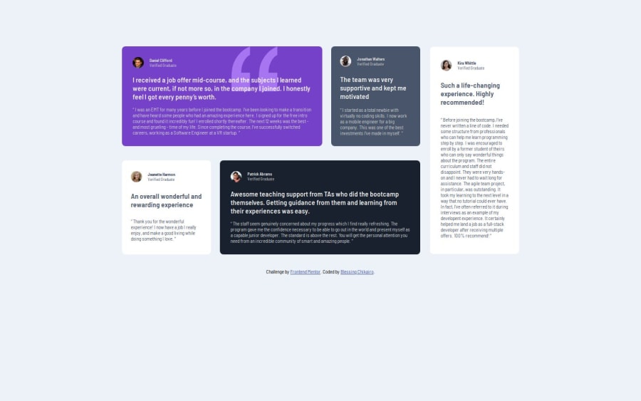
Design comparison
Community feedback
- @yiorgosbagakisPosted 6 months ago
Very nice work with clean and well structured html code.
Possibly adding a <picture> tag around the image avatars would help semanticly?
The only visual issue I see is that on some middle range screen widths the quotation mark icon is off the card. This should be adjusted.
Marked as helpful0@ChikairoPosted 6 months agoThank you @yiorgosbagakis.
About the middle range sceeen I really don't know how to get the quotation mark corrected, I would love any help or idea on how to do this.
0
Please log in to post a comment
Log in with GitHubJoin our Discord community
Join thousands of Frontend Mentor community members taking the challenges, sharing resources, helping each other, and chatting about all things front-end!
Join our Discord
