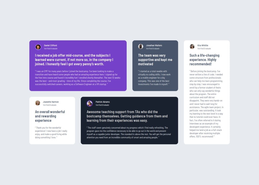


Design comparison

Solution retrospective
I am most proud of being able to show that I have a clear understanding of how to use css grid. I was able to create a responsive design that adapts to grid in mobile and desktop. One thing that I would work on is planning out my class names. I had to go back and condense my code since at one point I was getting repetitive because I hadn't realized that different elements had the same styling.
What challenges did you encounter, and how did you overcome them?One quick challenge that I was able to overcome was that initially my grid wasn't working for my tablet media query but it was because I hadn't resized the container so my elements weren't able to fit even though I had given them the correct grid-area. After I resized the container everything was able to fall into it's place.
What specific areas of your project would you like help with?I feel like my solution fits the style guide that was provided, all while being responsive to screen sizes. I would love any critique on how I could improve my coding where possible. Thank you.
Please log in to post a comment
Log in with GitHubCommunity feedback
- @Squ1nty
Asides from adding some shadow to each testimonial container, visually LGTM!

Join our Discord community
Join thousands of Frontend Mentor community members taking the challenges, sharing resources, helping each other, and chatting about all things front-end!
Join our Discord