Design comparison
Solution retrospective
I am proud that I completed this project and happy that I successfully accomplished the grading of these projects.
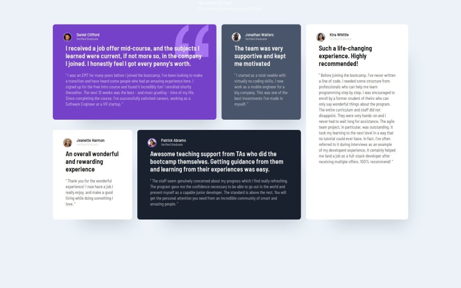
What challenges did you encounter, and how did you overcome them?I faced many challenges in this project to ensure that I could place each of these cards in the correct position using grid. It was a great experience and a valuable practice for me.
Community feedback
- @AdrianoEscarabotePosted 4 months ago
Hi Salva, hope you're doing well! I loved how your project turned out, but I’ve got a few suggestions that could be useful:
Using Flexbox or Grid on the
bodyto center elements ensures a more responsive and adaptive layout, fitting different screen sizes seamlessly. It avoids manual calculations and constant adjustments needed withmargin,padding, or absolute positioning. These techniques provide more consistent alignment and simplify the code.flexbox:
body {
    display: flex;
    justify-content: center;
    align-items:  center;
    min-height: 100vh;
}
grid:
body {
    display: grid;
    place-content: center;
    min-height: 100vh;
}
The rest is fantastic.
Hopefully, you'll find it helpful. 👍
0 - @salva-itPosted 4 months ago
Hi KapteynUniverse, thank you for reviewing my project. I have made the changes and added another 1fr column.
i know quote image is decorative I didn’t want to leave the alt attribute empty because of SEO.
0 - @KapteynUniversePosted 4 months ago
Hey Salva, nice job,
You should add another 1fr to the column
grid-template-columns: 1fr 1fr 1fr;to the container for desktop layout. With 3 column, it looks like grid making the fourth one automaticly because of the positioning of "Kira Whittle" but since that column created automaticly i think its width setting based on its content and that is pushing other articles and making them shrink. Also changing max-width of the container might be better. You can remove all the max-width from article after this too.@media screen and (min-width: 1024px) { .container { display: grid; grid-template-columns: 1fr 1fr 1fr 1fr; grid-template-rows: 1fr; max-width: 1024px; } }Also quote image is decorative, you can leave alt text empty.
0
Please log in to post a comment
Log in with GitHubJoin our Discord community
Join thousands of Frontend Mentor community members taking the challenges, sharing resources, helping each other, and chatting about all things front-end!
Join our Discord
