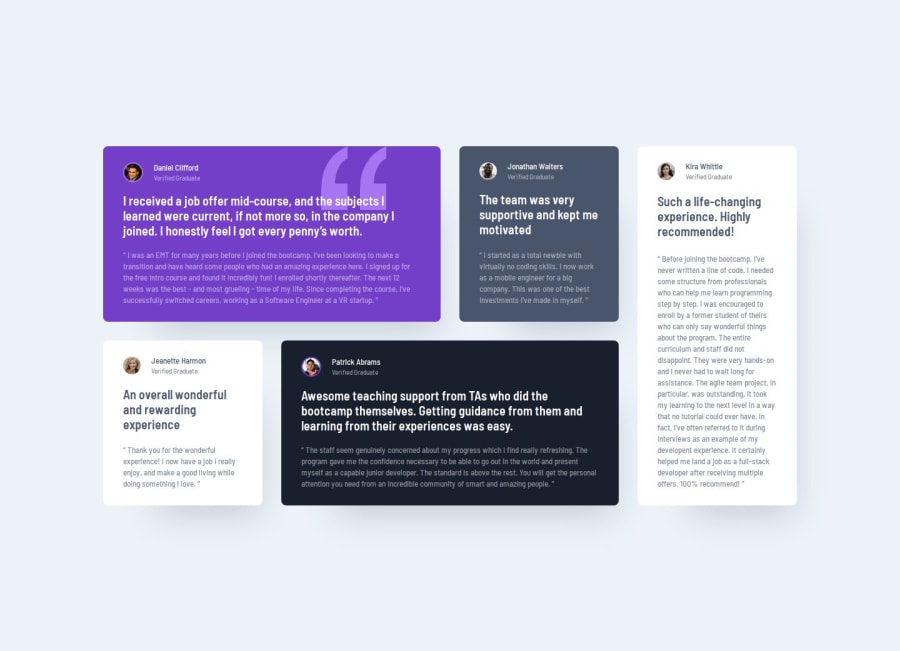
Design comparison
Solution retrospective
I pride myself on keeping the code as clear and simple as possible. respecting the design and paying attention to details.
For next time I would make css property classes that are reused.
What challenges did you encounter, and how did you overcome them?The separation of the elements on the cards, the background colors, the font colors and the borders of the images were different and thinking about how to approach the design without defining each card separately.
I decided to use the flex property ( justify-content: space-between) for the separation of elements and grid template areas classes for more specific details.
What specific areas of your project would you like help with?Any recommendation will be well received.
If you have any observations, advice or a better solution it would be very helpful.
Join our Discord community
Join thousands of Frontend Mentor community members taking the challenges, sharing resources, helping each other, and chatting about all things front-end!
Join our Discord
