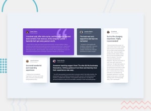
Design comparison
Community feedback
- @morauszkiaPosted 7 months ago
I like this solution. It uses semantic markup, which is great, and the layout change works fine. You might perhaps consider adding an inbetween layout with maybe 2 or 3 columns, so that the cards in the final layout just above the breakpoint wouldn't be as narrow as they currently are. The solution is very close to the design. You are only missing the borders on two photos. In your css you could also use additional classes or ids to distinguish the cards for the background colors and their placement in the grid. Otherwise the css looks great, too. Maybe you could omit parts of your reset which don't affect this webpage (ul, inputs, etc.) to get an even smaller css file.
1
Please log in to post a comment
Log in with GitHubJoin our Discord community
Join thousands of Frontend Mentor community members taking the challenges, sharing resources, helping each other, and chatting about all things front-end!
Join our Discord
