Testimonials-grid-section

Solution retrospective
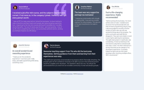
This project helped dive deeper into css grid, I learned how to span colums and rows, how to shift contents from one column/row to another. I am really proud of that. I can't think of anything I'd have done diffrent at the moment.
What challenges did you encounter, and how did you overcome them?Making the layout of the cards and aligning the quote image was my biggest challenge. I figured out the layout thanks to kevin powell and w3school, but I am still struggling with the image.
What specific areas of your project would you like help with?Well, like I stated the quote image was one of my biggest challenge on this product, especially for bigger screen. But I have fixed it :)
Please log in to post a comment
Log in with GitHubCommunity feedback
No feedback yet. Be the first to give feedback on OL's solution.
Join our Discord community
Join thousands of Frontend Mentor community members taking the challenges, sharing resources, helping each other, and chatting about all things front-end!
Join our Discord