Not Found
Not Found
Not Found
Not Found
Not Found
Not Found
Not Found
Not Found
Not Found
Not Found
Not Found
Not Found
Not Found
Not Found
Not Found
Not Found
Not Found
Not Found
Not Found
Not Found

Submitted

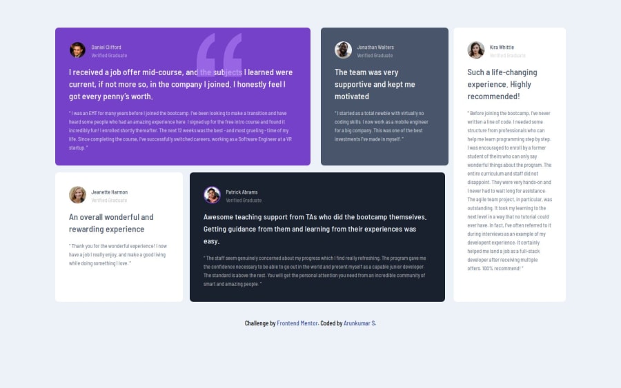
Testimonials grid section [HTML + Tailwind CSS]

Arunkumar Sโ€ข 100

@arunkumar0398

Desktop design screenshot for the Testimonials grid section coding challenge

This is a solution for...

  • HTML
  • CSS
2junior
View challenge

Design comparison


SolutionDesign

Solution retrospective


I have completed the challenge Testimonials Grid Section ๐Ÿฅณ

Languages that I have used ๐Ÿงฐ

  • HTML
  • Tailwind CSS

I would welcome any feedback or suggestions for improving the solution on this challenge. Feel free to leave your comments below. ๐Ÿ™

** Happy Frontend Mentoring ** ๐Ÿ‘

Community feedback

@Bishalsnghd07

Posted

Hi, @arunkumar0398๐Ÿ‘‹

Congrats for completing this challenge๐ŸŽ‰ and great work๐Ÿ‘

This challenge is specially made for enhance your skills in grid not in flex. I did not see any grid or any grid properties in your code, somewhere flex should be used, like in child div's not in all. I'm telling you this challenge is very good for upskilling in grid properties. I will recommend you to, if you don't know grid property, then learn some basics from youtube or anywhere and then take pen and paper and make the grids in which div you want. It will help you to come closer to the desire result with better approach for this challenge. And if you using grid in it, then you did not have to write this large number of code you have been written, it will be done it very easily way. By doing this code scalability will improve and also you will be become one step closer to responsive layout.

Hope, this small tip will help you.

Happy Codingโค๏ธ

0
Olaniyi Ezekielโ€ข 7,600

@Ezekiel225

Posted

Hello there ๐Ÿ‘‹ @arunkumar0398.

Good job on completing the challenge !

Your project looks really good!

I have suggestions about your code that might interest you.

๐Ÿ“Œ First: Use <main> to wrap the main content instead of <div>.

Tags like <div> and <span> are typical examples of non-semantic HTML elements. They serve only as content holders but give no indication as to what type of content they contain or what role that content plays on the page.

๐Ÿ“ŒIf you don't have the Figma design files, I recommend using a browser extension called Perfect Pixel.

It allows you to compare your finished project with the design images that come along when you download the project and check the (almost exact) dimensions. It's very useful!

๐Ÿ“ŒLearn more about Media Queries: Media queries are an essential part of responsive web design. They allow you to apply different CSS styles based on the characteristics of the device, such as screen width, height, orientation, and resolution. You can start by reading articles or tutorials on media queries to understand how they work and how to use them effectively.

Practice: The best way to become familiar with media queries is to practice using them in your projects. Start with simple layouts and gradually increase complexity as you gain confidence. Experiment with different breakpoints and CSS rules to see how they affect the layout on various devices.

Use a Mobile-First Approach: One popular strategy for responsive design is the mobile-first approach. This means designing the layout for mobile devices first and then adding styles for larger screens using media queries. This approach helps ensure that your website looks good on small screens and then adapts to larger screens.

๐Ÿ“ŒUnderstanding the importance of using External CSS over Internal CSS is crucial for writing cleaner, more maintainable code. Here's why you should make the switch:

๐Ÿ“ŒSeparation of Concerns: External CSS allows you to separate the structure (HTML) from the presentation (CSS). By keeping your styles in separate files, your code becomes more organized and easier to manage. This separation makes it simpler to update or modify styles without affecting the HTML structure.

๐Ÿ“ŒReusability: With External CSS, you can create a single stylesheet that can be linked to multiple HTML files. This promotes code reusability, saving you time and effort by avoiding duplicate styling code across your website.

๐Ÿ“ŒEase of Maintenance: Imagine having to update the styling of your website across multiple pages. With External CSS, you only need to make changes in one central stylesheet, rather than hunting down and updating each individual `` tags in your HTML files into this external stylesheet. Then, link your HTML files to the external stylesheet using the <link> tag in the <head> section:

<link rel="stylesheet" type="text/css" href="styles.css">

By adopting External CSS early in your coding journey, you'll set yourself up for success by writing cleaner, more maintainable code that is easier to collaborate on and update as your projects grow.

I hope this suggestion is useful for future projects.

Other than that, great job!

Keep up the excellent work and continue to challenge yourself with new projects. Your progress is impressive, and each project is a step forward in your front-end development journey! ๐Ÿš€๐ŸŒŸ.

Happy coding.

0

Arunkumar Sโ€ข 100

@arunkumar0398

Posted

Hey there ๐Ÿ‘‹@Ezekiel225,

Thank you for your feedback and valuable suggestions.

I will take those suggestions and implement it in the solution.

0

Please log in to post a comment

Log in with GitHub
Discord logo

Join our Discord community

Join thousands of Frontend Mentor community members taking the challenges, sharing resources, helping each other, and chatting about all things front-end!

Join our Discord