Design comparison
SolutionDesign
Solution retrospective
Any feedback or suggestions are appreciated:)
Community feedback
- @palgrammingPosted over 3 years ago
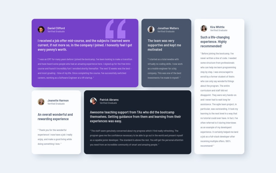
The Patrick and Daniel user Icons should have a purple border around them
Marked as helpful0@hafizanadliPosted over 3 years ago@palgramming haha I notice that in the beginning but totally forgot to implement that at the end lol. Thanks for the feedback:)
1@palgrammingPosted over 3 years ago@hafizanadli no problem it is really a test to get the selectors right just some of the little details that make things tricky
1
Please log in to post a comment
Log in with GitHubJoin our Discord community
Join thousands of Frontend Mentor community members taking the challenges, sharing resources, helping each other, and chatting about all things front-end!
Join our Discord
