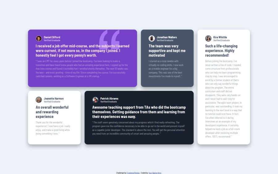


Design comparison

Solution retrospective
I set up the div and sections of every card properly but had issues with the main layout. When I figured out how to make the main layout everything was almost ready.
What challenges did you encounter, and how did you overcome them?This one took me a couple of days. I struggled a lot with setting up the layout at the beginning. After I checked my notes I figured it out and finally made it. I am sure the next project using Grid and Flexbox will be easier.
Community feedback
- @ShaunPourPosted about 1 year ago
There are a couple of small issues I can name right off although one is far less significant. First of all, this layout does not account for the decreased width of the mobile view at all as you have to scroll far over to the right to see all the content. One potential resolution would be to set a max width property on the grid container to ensure that it is always small enough to fit on screen (and remove it inside of your media query for desktop screens if necessary).
The next few aren't actually design problems and are more along the lines of code organization. I notice your attribution css is still present inside the style element within your html file. In the interest of keeping all your css together, I would recommend moving this css to the styles.css file and removing the styles html element.
Also, it would help your organization to have the media queries in order by screen size (smallest to largest is my personal preference) so putting the 768px screen size media query above the 1024 one might be worthy of consideration.
Marked as helpful0@cristianccggPosted about 1 year agoHello, @DarkPhoenixNinja92
Thank you so much for taking the time to check the code and write your message. I have a lot of questions regarding the code organization and media query, and you helped me a lot. I will make the changes and see how it goes.
Thanks again.
1

Please log in to post a comment
Log in with GitHub
Join our Discord community
Join thousands of Frontend Mentor community members taking the challenges, sharing resources, helping each other, and chatting about all things front-end!
Join our Discord