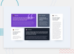
Design comparison
SolutionDesign
Community feedback
- @franexmo81Posted about 1 year ago
Great job with this challenge. Nice and clean.
I've only noticed a couple of things that could be improved:
-
User info (name and Verified Graduate) are aligned on left on the design, but appear centred on your solution.
-
You could have grouped some properties for the profile images, like this:
.profile-image{
    height: 28px;
    width: 28px;
    border-width: 1px;
    border-style: solid;
    border-radius: 50%;
    margin-right: 13px;
}

.dan {
    border-color: var(--White);
}

.jon {
    border-color: var(--Moderate-violet);
}
Also, remember to replace Your name here on the footer 😉
Happy coding!
1@girldocodePosted about 1 year ago@franexmo81 thanks for reviewing my code. I realized it later. yeah hahah i even forgot to add my name.
1 -
Please log in to post a comment
Log in with GitHubJoin our Discord community
Join thousands of Frontend Mentor community members taking the challenges, sharing resources, helping each other, and chatting about all things front-end!
Join our Discord
