Design comparison
Solution retrospective
10/28/20
Honest feedback/criticism is appreciated! Any suggestions on how I can improve this solution?
Community feedback
- @ApplePieGiraffePosted about 4 years ago
Hey, Dwight! π
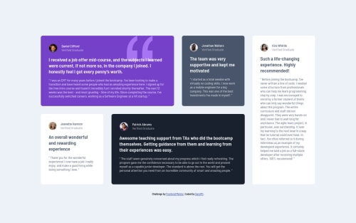
Great job on this challenge! Your solution looks good and responds very well! π
I only suggest,
- Making the hover effect over the testimonial boxes just a little more subtle. It's definitely a cool effect, but scaling the boxes slightly less would be a good idea, I think, and help maintain some space between the boxes. π
Keep coding (and happy coding, too)! π
1@SarsiPCPosted about 4 years ago@ApplePieGiraffe awww... I thought that effect would help the visitor to focus on the grid they're trying to read.
Thanks for your suggestion! I really appreciate them!
0@ApplePieGiraffePosted about 4 years ago@SarsiPC
Hey, Dwight!
Hey, no that animation's a nice idea! (I actually did the same thing when I completed this challenge). π
I just thought the boxes were scaling a little too muchβslightly less would make the effect more subtle and... I little nicer, I thought.
Happy coding! π
1
Please log in to post a comment
Log in with GitHubJoin our Discord community
Join thousands of Frontend Mentor community members taking the challenges, sharing resources, helping each other, and chatting about all things front-end!
Join our Discord