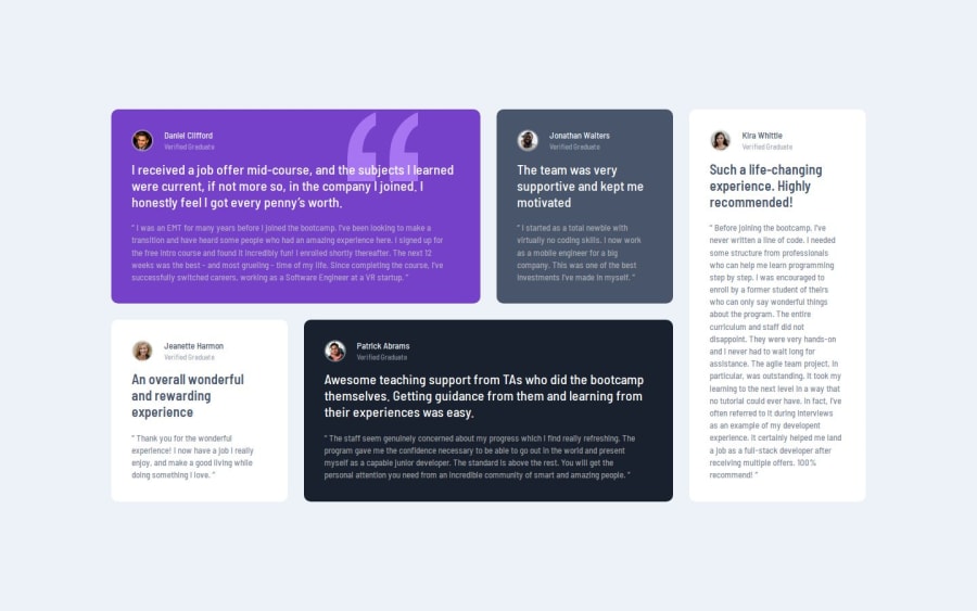
Testimonials Grid Section developed using Css Grid and Flex


Design comparison

Solution retrospective
I am proud of develop this design in 4 hours without design files as a beginner. Next time I will try to do a more responsive design like elements are resizing according to the devices in between the mobile and desktop design.
What challenges did you encounter, and how did you overcome them?The challenge I encountered was deciding the element sizes without design files and I overcome this by some math, trial and error.
What specific areas of your project would you like help with?I want some help in how to resize the elements with device size changes like fluid in between mobile and desktop.
Example : div size fluidly changing while resizing window but same time elements inside div also resizing and align perfectly.
This my expected output as aspiring developer, So if it can happen. How?
Community feedback
Please log in to post a comment
Log in with GitHub
Join our Discord community
Join thousands of Frontend Mentor community members taking the challenges, sharing resources, helping each other, and chatting about all things front-end!
Join our Discord