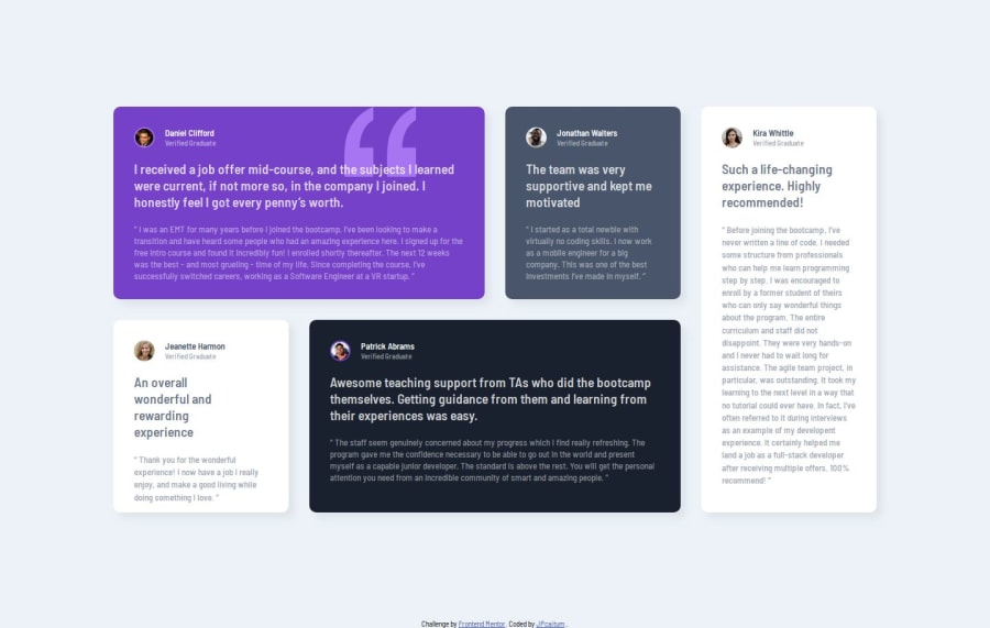
Design comparison
Community feedback
- @AdrianoEscarabotePosted 6 months ago
Hi JPcaitum, hope you're doing well! I loved how your project turned out, but I’ve got a few suggestions that could be useful:
I noticed that you use more than one h1, this is not a good practice since it is recommended to have only one h1 per page to inform the main title of the page! so remove all h1 and put h2
images must have alt text unless it is a decorative image, for any decorative image each IMG tag must have empty alt="" and add aria-hidden="true" attributes to make all the assistive technologies of the Web, as screen reader.
Learn the differences between decorative/meaningless images vs important content.
The rest is fantastic.
Hopefully, you'll find it helpful. 👍
Marked as helpful0 - P@NouranAlSharawnehPosted 6 months ago
Excellent work! it looks exactly the same as the design provided. However, for Kira's card, I think the color used for her description overview is lighter than what it should be.
Marked as helpful0
Please log in to post a comment
Log in with GitHubJoin our Discord community
Join thousands of Frontend Mentor community members taking the challenges, sharing resources, helping each other, and chatting about all things front-end!
Join our Discord
