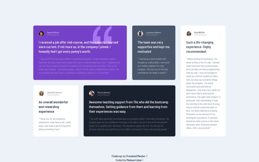
Design comparison
SolutionDesign
Solution retrospective
What challenges did you encounter, and how did you overcome them?
Had some trouble getting the design right, don't have access to the Figma files, so, some aspects maybe off.
What specific areas of your project would you like help with?I would like tips and constructive criticism.
Community feedback
- @junwei-wongPosted 3 months ago
Nice work, I just completed challenge and felt it's really tough to just use grid.
Here are some feedbacks:
- For the
Verified Graduate
and the description <p>, can consider the tip from the style guide md file on using theopacity:50% or 70%
property to make it closer to the design rather than hardcoding the color. - This one is more of an alternative I recently learned which I find it pretty cool, is that we can use css to inject the quotation svg into the background instead.
background-image: url(../images/bg-pattern-quotation.svg); background-size: 7rem 7rem; background-repeat: no-repeat; background-position: top right 18%;
Marked as helpful0 - For the
Please log in to post a comment
Log in with GitHubJoin our Discord community
Join thousands of Frontend Mentor community members taking the challenges, sharing resources, helping each other, and chatting about all things front-end!
Join our Discord