Submitted about 4 years ago
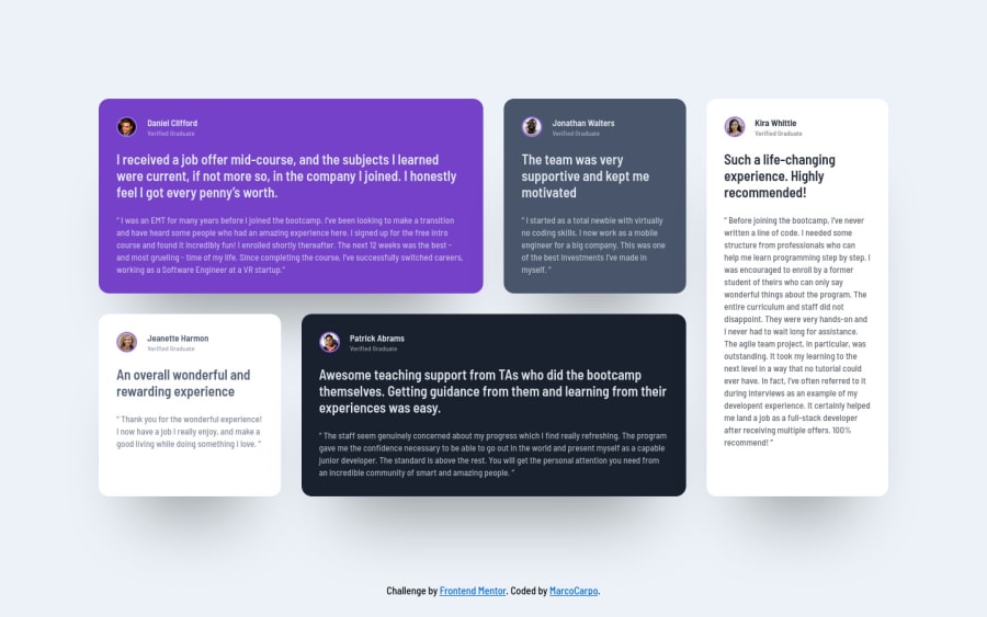
Testimonials grid section challange with responsive Flex and Grid
@MarcoCarpo
Design comparison
SolutionDesign
Solution retrospective
It would be great if someone could give me some feedback about the project and how it could be improved! Thanks a lot!
Community feedback
- @ApplePieGiraffePosted about 4 years ago
Hey, nice work on this challenge, Marco! 👍
Your solution looks good and is responsive! 🙌
I suggest,
- Setting a
max-widthon the main container or wrapper so that the content of the page doesn't look too stretched on large screens. - Decreasing the space between the left and right sides of the cards when they break into a multi-column layout to match the space between tops and bottoms of the cards.
Keep coding (and happy coding, too)! 😁
1 - Setting a
Please log in to post a comment
Log in with GitHubJoin our Discord community
Join thousands of Frontend Mentor community members taking the challenges, sharing resources, helping each other, and chatting about all things front-end!
Join our Discord
