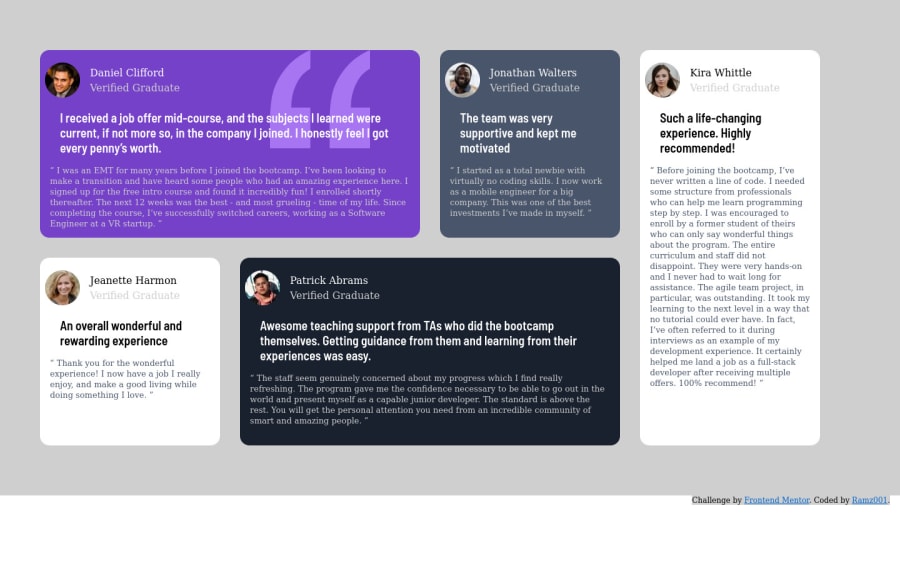
Design comparison
Solution retrospective
Overall website looks pretty identical but I cannot make user boxes both bigger and center them ,so in the mobile view they are a bit smaller than expected. Hope someone could help!
Community feedback
- @ChamuMutezvaPosted over 3 years ago
see if the following can help, i have commented out the code that i think is not needed in mobile
.container {
	grid-template-columns: 1fr;
	/* grid-template-rows: repeat(9, 15rem); */
	/* grid-area: "user-1" "user-2" "user-3" "user-4" "user-5"; */

	justify-items: center;
}

.container {
	background: var(--light-gray);
	background-size: cover;
	display: grid;
	/* grid-area: "user-1 user-1 user-2 user-5" "user-3 user-4 user-4 user-5"; */
	/* grid-template-columns: repeat(4,18rem); */
	/* grid-template-rows: 300px 300px; */
	grid-gap: 2rem;
	padding: 5rem 2rem; //adjust your padding
}
Marked as helpful0@Ramz001Posted over 3 years ago@ChamuMutezva In the code instead of writing grid-template-areas i wrote grid-area so my code was not working properly i mean it worked only due to grid-column and grid-row so after dinding that error no code is much smaller and more semantic
1 - @ChamuMutezvaPosted over 3 years ago
- the design is close on desktop but for mobile and medium devices , there is still some work to be done. Some content are hidden or cut off from view
- using
!importantin your css is a sign that you need to revisit your styling - it is something you need to resist unless maybe when overriding some framework styling. - if the image is just for decoration use
alt="",<img src="images/bg-pattern-quotation.svg" alt="background" class="quote-svg">. Alt values should benefit assistive tech users to visualize the message that is being put across. - an inline element like a
spanshould not be used to be a parent of a block elementdiv
<span> <div>Kira Whittle</div> <div class="user-level">Verified Graduate</div> </span>- use semantic html where possible ahead of elements like a div
0@Ramz001Posted over 3 years ago@ChamuMutezva First of all thanks for the feedback I've changed the code for a bit by deleting div and writing p instead as well as deleting !important and position media query in the bottom of the CSS ,but here's the thing that I cannot do much of thing in the mobile view I mean neither justify-content nor justify-self is working so that I can center the items and make them a little bigger. Could you suggest anything in particular ?
0
Please log in to post a comment
Log in with GitHubJoin our Discord community
Join thousands of Frontend Mentor community members taking the challenges, sharing resources, helping each other, and chatting about all things front-end!
Join our Discord
