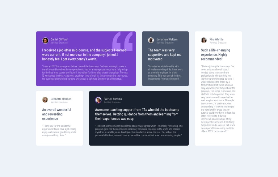
Design comparison
Solution retrospective
I used CSS grid for some projects before but it's been pretty rusty and I needed to brush up on it. I think I could apply the basic CSS grid concept well but I'd love to hear if there is anything that I could improve on!
Community feedback
- @ericsalviPosted about 2 years ago
Hey @yui,
Great job on your 4th solution completed. Everyone does these solutions differently and Lucas did offer some great feedback to be a bit more semantic. I actually just completed this one too and I had no Divs, no Spans, or no Class Names. It was actually a fun challenge and made me really think about the structure before I started with the design.
There is one thing I did notice that I am not a fan of and not sure if there was a different approach. Positioning the entire content by using an absolute position with a top and left of 50% and then translating it with a -50% to me is not the best and could cause unexpected results.
Instead, what a great thing to do is instead on the main container, and in this case, the body set the min-height to 100vh and then display it as a grid. This way you can then use the easy place-content to center. Of course, you need to also make sure you set a max-width container to your grid items, which is the main.
What I do like is that you are using grid templates which is really nice and you also did a mobile-first approach. Much nicer to only have to change a few lines for desktop if you do mobile-first rather than if you do desktop first you have to add way more lines of CSS in order to shrink things down.
Again, great job and keep up the momentum!!!
Marked as helpful0@yteraiPosted about 2 years ago@ericsalvi Thanks for your feedback, Eric! I was actually aware of the thing that you pointed out and I don't really like it either but I wasn't able to find a better solution🥲 (I didn't even think to set the body displaying it as a grid!) It will be one more new thing to keep in mind for my future challenges!
0 - @correlucasPosted about 2 years ago
👾Hello @yterai, congratulations on your new solution!
Great code and great solution! I did this challenge too and know how hard it is to set up this
grid layout
. I think you've done a really good job building everything! Here are some tips for you:The html structure you’ve used here works, but if you want to make this even better, you can replace the
<div>
you’ve used to keep the blocks and replace with some better html markup and semantic, for example, the main block can be wrapped with<main>
and each testimonial card with<article>
, then you can use a tag that not everyone knows, for the paragraph containing thequote
you can replace the<p>
with<blockquote>
that is tag the describe exactly its content.This article from Freecodecamp explains the main HTML semantic TAGS: https://www.freecodecamp.org/news/semantic-html5-elements/
✌️ I hope this helps you and happy coding!
Marked as helpful0@yteraiPosted about 2 years ago@correlucas Thanks for your feedback, Lucas! You got a point and I definitely need to practice more using semantic elements!
1 - @maiaflowPosted about 2 years ago
well done as always Yui! i like how you used grid areas/grid template areas.. i still don't quite get how those work yet! also cool how you did grid within a grid. excited to see your next submission!
1
Please log in to post a comment
Log in with GitHubJoin our Discord community
Join thousands of Frontend Mentor community members taking the challenges, sharing resources, helping each other, and chatting about all things front-end!
Join our Discord