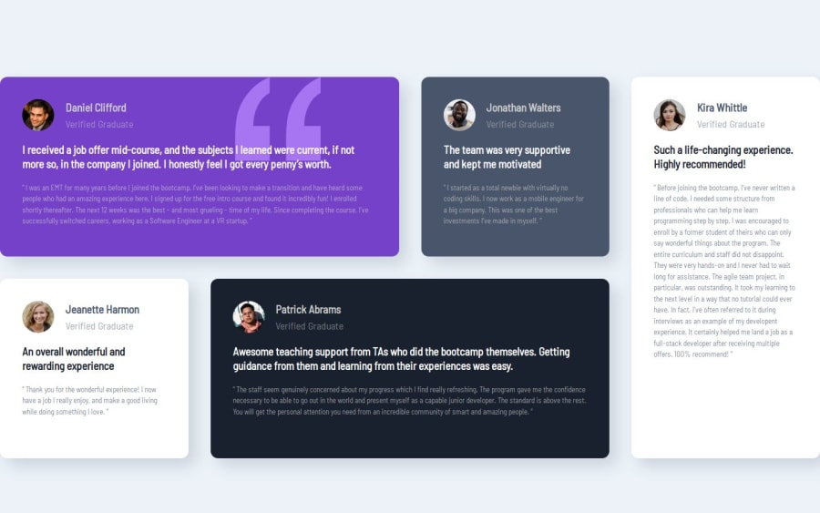
Design comparison
Solution retrospective
Leaning how to use grid system especially grid-template-areas
What challenges did you encounter, and how did you overcome them?When resizing the text on small screen to larger screen, My paragraph on grid items were overflow out of the container. My solution were to not changing the font-size but that was a bad one.
What specific areas of your project would you like help with?Everything as this community will point out.
Community feedback
- @tailor-made-godPosted 6 months ago
Your website almost matching the design. expect few things, the sizes are different and the grid is not centered horizontally because of its size.
To fix this,
- fix the grid size and use the max width on the grid parent
- then align horizontally with place content
- resize the icon and author name with smaller values
- inside the div resize the paragraph elements with matching value
- to align the lines to match the design use max width property again in percentage because its works well in mine
Basically the size of the elements are bigger than design.
Other than that your project matching the design very closely and the code you written is clean.
0
Please log in to post a comment
Log in with GitHubJoin our Discord community
Join thousands of Frontend Mentor community members taking the challenges, sharing resources, helping each other, and chatting about all things front-end!
Join our Discord
