Design comparison
Solution retrospective
I would like feedback and want to know the highest point anyone can get.
Community feedback
- @krishna-nayakPosted almost 4 years ago
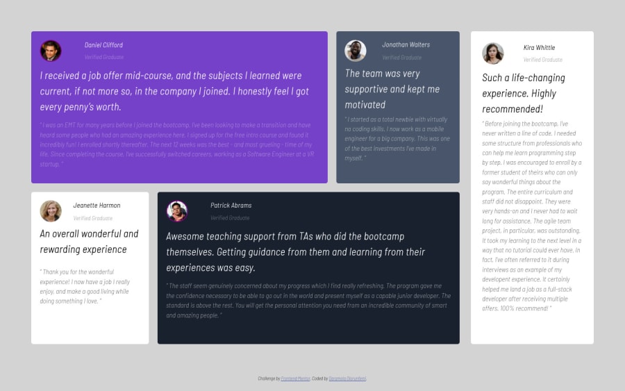
Try to Remove all height value from class "fat", "thin", "thin-1", "fat-1" - removing height means it adjusts its height according to the text. but, you have given the height fixed px value so it maintaining it 375px ... and give @media(max-width: 800px) in place of 1024px. You mainly use Flex-Box, I guess, but give it a try in Grid-CSS. Grid-CSS more flexible in 2D layout, whereas flex-Box is best for 1D layout.
0@berryboylbPosted almost 4 years ago@krishna-nayak thanks I would try grid CSS, but removing the height for fat and thin will make them of different heights.
0
Please log in to post a comment
Log in with GitHubJoin our Discord community
Join thousands of Frontend Mentor community members taking the challenges, sharing resources, helping each other, and chatting about all things front-end!
Join our Discord
