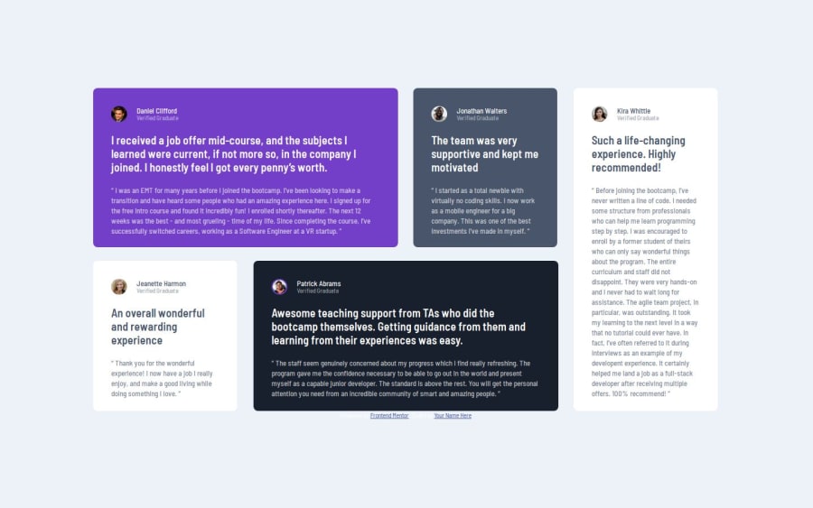


Design comparison

Solution retrospective
I’m most proud of successfully implementing a responsive grid layout that works well across different screen sizes. Using grid-template-areas allowed for precise placement of the cards on desktop, ensuring the layout matched the design mockup. The use of CSS variables for colors and spacing made the code more maintainable and scalable. By leveraging these techniques, the layout remains visually consistent and adaptive, whether viewed on mobile or desktop.
If I were to approach this project again, I’d focus on improving the tablet view, as the transition between mobile and desktop could use refinement to ensure proportional spacing and alignment. Additionally, I’d explore ways to optimize the grid layout further, perhaps by experimenting with dynamic column sizing (minmax() or auto-fit) to make it more flexible without relying heavily on fixed dimensions or areas.
What challenges did you encounter, and how did you overcome them?The main challenge was ensuring the grid layout adjusted correctly between mobile and desktop views. On larger screens, the cards initially displayed inconsistently, exceeding three columns and disrupting the design. Introducing grid-template-areas resolved this issue, providing precise control over card placement and ensuring alignment with the mockup. This approach was particularly helpful for defining overlapping areas and maintaining a balanced visual hierarchy. Additionally, setting explicit max-width constraints on the container helped keep the layout from stretching too wide, preserving its intended structure. These solutions highlight the importance of combining CSS grid properties with thoughtful constraints for responsive design.
What specific areas of your project would you like help with?I’d appreciate feedback on optimizing the grid layout for better scalability and responsiveness. While using grid-template-areas resolved the issue of inconsistent card placement, I’d like to know if there are more efficient or flexible ways to manage the layout, especially for intermediate screen sizes like tablets. Suggestions on handling transitions between mobile and desktop views more seamlessly would be particularly helpful.
Additionally, I’d welcome advice on improving the design’s interactivity and accessibility. For example, adding subtle animations or hover effects to the cards could make the user experience more engaging. Feedback on ensuring the solution adheres to accessibility best practices, such as clear focus states and meaningful alt text for images, would also be valuable. Let me know if there are other areas I could refine to enhance the project further!
Community feedback
- P@makogeborisPosted 2 months ago
Great work, some suggestions for improvement
- The fixed widths and heights defined in multiple elements is causing overflow and some issues with responsiveness, start by removing the
widthproperty from the .container on small screens and also remove themarginproperty and instead usepaddingon thebodyto allow some spacing between the container and the body. Also Change theheight: 100vh;on the body tomin-height: 100vh. Usingmin-heightensures the content can grow beyond the viewport height if necessary, whileheightwould restrict it to exactly the viewport height, potentially causing overflow issues. Add agap: 2rem;on thebodyto give space between the container and the attribution. Wrap the .attribution in afootertag - Remove the
heightproperty from the .conatainer in the media query, generally you should avoid setting fixed heights and widths on elements, as this can create problems with responsiveness and content fit. Instead, let the content and padding determine the element’s size. Also change themax-widthdeclaration to useremnotpx. Media queries, font-sizes should be defined inremnot px - Remove all the
heightandwidthproperties from all thearticleand .quote elements - Use a class instead of an ID for styling to keep specificity low, reserve IDs for JavaScript manipulation.
- Consider using a modern CSS reset at the start of the styles in every project. Like this one Modern CSS Reset. This will help reset a list of default browser styles.
Hope this helps, Good luck!
0 - The fixed widths and heights defined in multiple elements is causing overflow and some issues with responsiveness, start by removing the

Please log in to post a comment
Log in with GitHub
Join our Discord community
Join thousands of Frontend Mentor community members taking the challenges, sharing resources, helping each other, and chatting about all things front-end!
Join our Discord