Design comparison
SolutionDesign
Solution retrospective
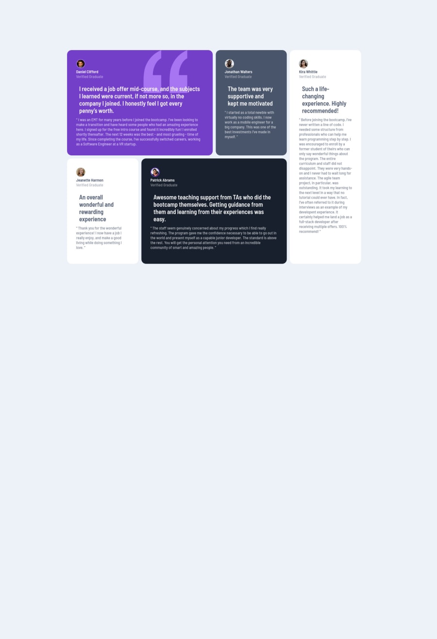
The hardest part of this challenge was dealing with Grid CSS because I don't usually use it, so I will surely study it more and put it more into practice.Any recommendations are welcome, I appreciate the feedback.
Community feedback
- @hyrongennikePosted about 2 years ago
HI @Escobar23,
It looks good, just remember to use semantic html tags it describe the content between and is better for accessibility.
Below is a link to my solution to see a different perspective.
Congrats on completing the challenge.
Marked as helpful0
Please log in to post a comment
Log in with GitHubJoin our Discord community
Join thousands of Frontend Mentor community members taking the challenges, sharing resources, helping each other, and chatting about all things front-end!
Join our Discord
