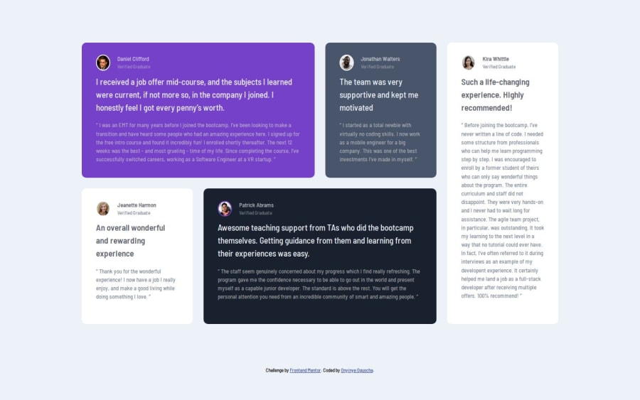
Design comparison
Solution retrospective
I'm proud of how much I’ve improved with CSS Grid, creating responsive layouts quickly and with more control. Next time, I’d like to focus on refining grid setups to enhance responsiveness across all screen sizes.
What challenges did you encounter, and how did you overcome them?One of the main challenges I faced was understanding how grid areas work and how to align items as intended. I overcame this by studying examples on W3Schools and experimenting with different layouts until I achieved the look I wanted.
What specific areas of your project would you like help with?I'd appreciate help with refining my CSS Grid layout skills, especially for handling complex layouts and responsive adjustments. Any tips on structuring CSS for cleaner, more maintainable code would also be invaluable. Additionally, I'd like feedback on why the background quotation mark showed correctly in my browser but disappeared after hosting.
Community feedback
- @elijahraphael5Posted 18 days ago
yes it does nothing it actually okay yes very structured yes I think I used a more detailed approach
0
Please log in to post a comment
Log in with GitHubJoin our Discord community
Join thousands of Frontend Mentor community members taking the challenges, sharing resources, helping each other, and chatting about all things front-end!
Join our Discord
