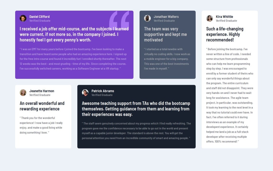
Design comparison
SolutionDesign
Community feedback
- @oduwa-APosted 7 months ago
Pretty good! Make sure to be aware of the padding, as your padding isn't exact to the design, alittle short. Using margin-inline to center your text was pretty genius of you, I didn't know such an element existed.
Marked as helpful1 - @mdnaimurPosted 7 months ago
suggest --use proper margin and padding --code name convention and proper code hygiene
overall good keep coding
Marked as helpful0
Please log in to post a comment
Log in with GitHubJoin our Discord community
Join thousands of Frontend Mentor community members taking the challenges, sharing resources, helping each other, and chatting about all things front-end!
Join our Discord
