Submitted over 1 year agoA solution to the Testimonials grid section challenge
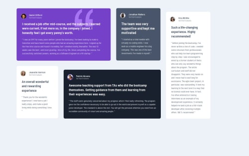
Testimonials grid section
@Ghm84

Solution retrospective
What are you most proud of, and what would you do differently next time?
Finishing another challenge and keep learning is something to be proud of.
What challenges did you encounter, and how did you overcome them?The position of cards on desktop version and some adjustments in paragraphs and other stuff took me some extra time.
What specific areas of your project would you like help with?Any suggestions will be appreciated.
Code
Loading...
Please log in to post a comment
Log in with GitHubCommunity feedback
No feedback yet. Be the first to give feedback on Gabriel's solution.
Join our Discord community
Join thousands of Frontend Mentor community members taking the challenges, sharing resources, helping each other, and chatting about all things front-end!
Join our Discord