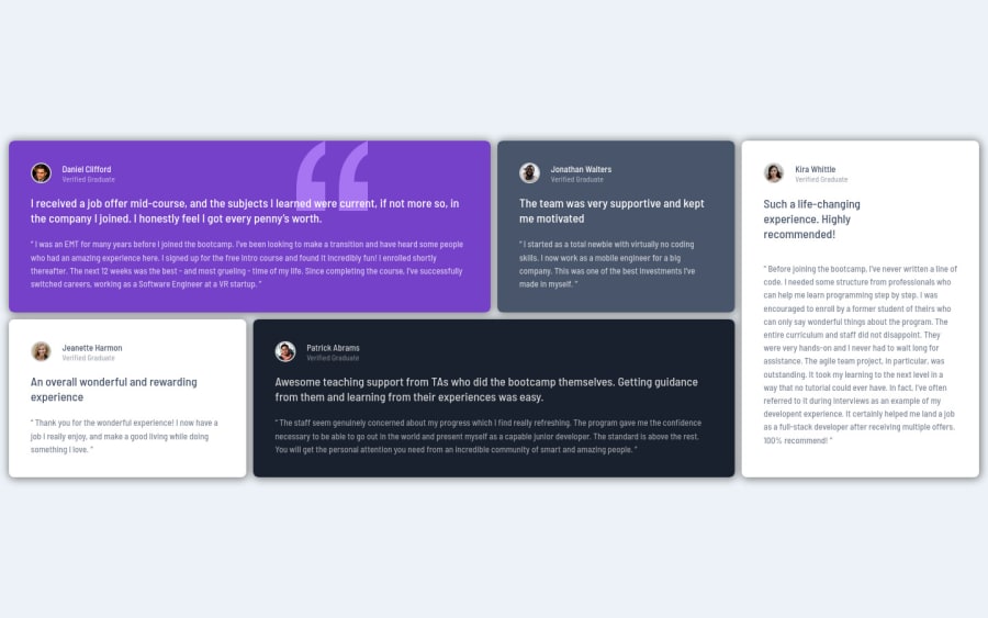
Design comparison
Solution retrospective
Hello friends, hope your OK, please i need tips and corrections for my project. Thank You!
Community feedback
- Account deleted
Hey there! 👋 Here are some suggestions to help improve your code:
- The profile images alt tags need to be improved. It should state the following; “Headshot of -person’s full name-“
More Info:📚
- To improve the semantics of your component, you will want to wrap each individual testimonial component in a Figure Element, the individuals information should be wrapped in a Figcaption Element and lastly, the testimonial itself should be wrapped in a Blockquote Element.
Code:
<figure>
   <figcaption></figcaption>
   <blockquote></blockquote>
</figure>
More Info:📚
If you have any questions or need further clarification, feel free to reach out to me.
Happy Coding!🎄🎁
Marked as helpful1@ikennarichardPosted over 2 years ago@vcarames Hello V!, I'm so grateful to you for all your help. Thank you so much 🎄🎁
0Account deleted@ikennarichard
Glad I could help!
Keep it up!
0 - @AdrianoEscarabotePosted over 2 years ago
Hello Ikenna Oguejiofor, how are you? I truly loved your project's outcome, however I have some advice that I hope you'll find useful:
I noticed that in higher resolutions the content is stretching a lot and this is harming the design of the project, to fix this in a simple way we can use a
max-width.@media (min-width: 970px) main { max-width: 1110px; }The remainder is excellent.
I hope it's useful. 👍
Marked as helpful0@ikennarichardPosted over 2 years ago@AdrianoEscarabote Yes it is Adriano, thanks a lot! 😍
1
Please log in to post a comment
Log in with GitHubJoin our Discord community
Join thousands of Frontend Mentor community members taking the challenges, sharing resources, helping each other, and chatting about all things front-end!
Join our Discord
