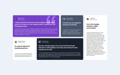
Design comparison
Solution retrospective
I took too much time, I will try to do things quick next time.
What challenges did you encounter, and how did you overcome them?I struggled with layout a lot, I saw videos about grid and flex then I applied all the things, some of them worked.
What specific areas of your project would you like help with?I was struggling with font color and sizes, if someone could help me with this?
Community feedback
- @juliengDevPosted 4 months ago
Hey there @Faisalbaig1998 š! Here are some suggestions to help improve your code:
HTML Improvements:
-
Use Semantic HTML Elements:
- Replace
div
elements with the classcard
by usingfigure
,figcaption
, andblockquote
elements. This is more appropriate for testimonials.
- Replace
-
Improve Accessibility:
- Add meaningful alternative descriptions (alt) for images to enhance accessibility.
Best Practices for Resetting Your CSS Code:
-
Reset Margins and Padding:
* { margin: 0; padding: 0; }
-
Consistent Box-Sizing Model:
*, *::before, *::after { box-sizing: inherit; }
By setting
box-sizing
toinherit
for all elements and pseudo-elements, the box model remains consistent throughout the document. Then, settingbox-sizing: border-box;
onhtml
ensures that all widths and heights include borders and padding, simplifying the calculation of element dimensions. -
Set Base Font Size:
html { box-sizing: border-box; font-size: 62.5%; }
Setting the base font size to 62.5% on
html
makes text size calculations easier. Since 62.5% of the default 16px font size equals 10px, 1rem equals 10px, simplifying conversions between relative (rem) and absolute (px) units. For example, 1.6rem equals 16px, which is more intuitive than working with text sizes based on a default 16px base size. -
Ensure Full Viewport Height:
body { min-height: 100dvh; }
By setting
min-height: 100dvh;
, the body of the document covers at least the viewport height, which is especially useful for "hero" layouts or ensuring the footer remains at the bottom of the page. Using CSS variables for colors allows for easier customization and maintenance of the site theme. -
Use Relative Units:
- Use relative units (rem, em) instead of pixels to improve responsiveness.
- Example:
width: 30px;
can be replaced withwidth: 2rem;
.
-
Improve Responsiveness:
- When resizing the page, the design breaks in several places.
- Add additional media queries for more varied screen sizes.
- Example: Add breakpoints for tablets and desktops.
-
Reduce Redundant Styles:
- Combine redundant styles for similar elements.
You said that you was struggling with font color and sizes, if someone could help me with this? here is some recommendations :
-
Use a Design Tool: Open the JPEG in a design tool like Figma, Adobe XD, or Sketch. These tools allow you to inspect and extract style information such as font sizes, colors, and other design details.
-
Extract Colors and Fonts: Use color picker tools within the design software to get the exact hex/RGB values for the font colors. Identify the fonts used in the design. You can use tools like WhatTheFont or Font Squirrel Matcherator to recognize fonts from images if not provided.
-
Set Up CSS Variables: Define CSS variables for colors and fonts to maintain consistency and ease of updates.
<Happy Coding/>! š¾
Marked as helpful0@Faisalbaig1998Posted 4 months agoThank you! That information is very helpful, I didn't find these things anywhere yet @juliengDev
1 -
Please log in to post a comment
Log in with GitHubJoin our Discord community
Join thousands of Frontend Mentor community members taking the challenges, sharing resources, helping each other, and chatting about all things front-end!
Join our Discord