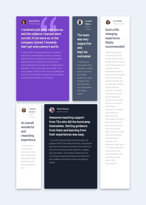
Submitted about 1 year agoA solution to the Testimonials grid section challenge
Testimonials grid section
sass/scss, bem
@Lazur05

Solution retrospective
What specific areas of your project would you like help with?
- In my desktop breakpoint, the cards seem to be too big and compressed, and I don't know exactly how to deal with it
- Any advice is welcome
Code
Loading...
Please log in to post a comment
Log in with GitHubCommunity feedback
No feedback yet. Be the first to give feedback on LAZUR's solution.
Join our Discord community
Join thousands of Frontend Mentor community members taking the challenges, sharing resources, helping each other, and chatting about all things front-end!
Join our Discord