Design comparison
Solution retrospective
Having practiced in the last few projects I think i got the hang out of Sass and the basics of HTML and CSS.
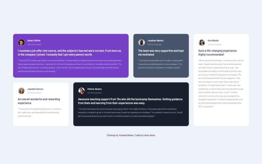
What challenges did you encounter, and how did you overcome them?I tried to manually stablish the location of each card using the grid-colums and grid rows. I noticed that its a lot of work to do it that way, I managed to do it but later change it to use grid areas since its simpler to understand and less code to make it function.
What specific areas of your project would you like help with?I need help with the quote image that's supposed to be in the first card, it shows locally in my pc (check the images on the GitHub repo), but when deployed to GitHub pages it disappears.
Please log in to post a comment
Log in with GitHubCommunity feedback
No feedback yet. Be the first to give feedback on Carlos Marte's solution.
Join our Discord community
Join thousands of Frontend Mentor community members taking the challenges, sharing resources, helping each other, and chatting about all things front-end!
Join our Discord
