

Design comparison

Solution retrospective
I would love to receive general feedback and any best practices I can use moving forward.
Community feedback
- @Franco-CipollaPosted 18 days ago
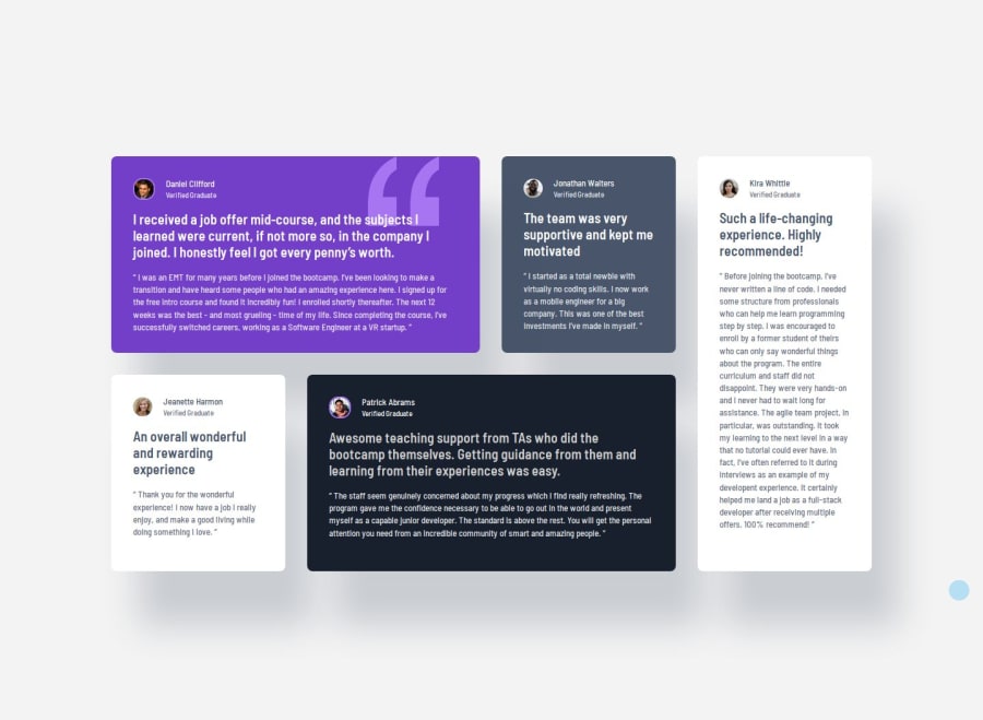
Very ncie! I like that it has different stages. I also did implement that and your gap is nice at mobile. I like that you have so strong shadow that makes it elevate a little bit more. Your white Testimonials are a bit too long tho maybe i would shorten them to make it look more clean. I also like the gap in the middle Stage i call it. Generally your spacing between is very nice because it makes it more readable and also aestathic and pleasing for the viewer and there is not too much going on in the screen so i like it. The color of p is not right tho i would turn down the opacity to 80% or 70% maybe. That cleans it up and will be more pleasuring for the reader and viewer because there isnt too much white
0

Please log in to post a comment
Log in with GitHubJoin our Discord community
Join thousands of Frontend Mentor community members taking the challenges, sharing resources, helping each other, and chatting about all things front-end!
Join our Discord