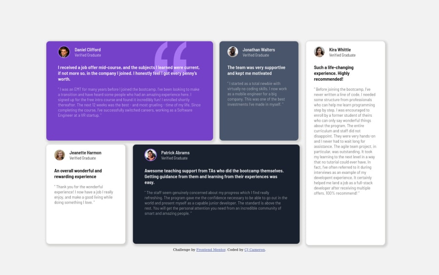
Design comparison
Solution retrospective
First project after a bit of a hiatus so I felt rusty and parts of the code feel sloppy. However, it works. Struggled the most with font sizing, and using the appropriate size for different screen sizes. I started with vh units but that made the font unreasonably small on smaller viewports. I decided to go with rem units and a couple extra media queries.
Any tips and suggestions are most definitely welcome!
Community feedback
- @nelsonleonePosted almost 2 years ago
HELLO.....congrats on completing this challenge. ๐ ๐ well done.
Based on what you said onfont size , you can use
clamp()
function . It is a css built in function that allows you to specify different font-size for different viewport .You can read more about the
clamp()
in the MDN docs. Here's a tool i use, it allows you to specify your viewport(start(e.g mobile) , end) FLUIDTYPOGRAPHYHope this comment was helpful, have fun coding
Marked as helpful0 - @MelvinAguilarPosted almost 2 years ago
Hi there ๐. Good job on completing the challenge ! I have some feedback for you if you want to improve your code.
HTML:
- Use the
<main>
tag to wrap all the main content of the page instead of the<div>
tag. With this semantic element you can improve the accessibility of your page.
- Use the
<footer>
tag to wrap the footer of the page instead of the<div class="attribution">
. The<footer>
element contains information about the author of the page, the copyright, and other legal information.
- You must use a level-one heading (h1) even though this is not a full-page challenge. You can create an '<h1>' element within your 'main' element that will be hidden visually but visible and readable by screen readers. The class "sr-only" hides content visually and here are the styles to copy. e.g.:
<h1 class="sr-only">Testimonials grid section</h1>
- The
alt
attribute should not contain the words "image", "photo", or "picture", because the image tag already conveys that information.
If you want to learn more about the
alt
attribute, you can read this article.- To improve the semantics of your code you should use the
<figure>
and<blockquote>
tags to wrap the testimonials, with this, you will be able to encapsulate the author and the citation of the testimonial.
Example:
<figure> <blockquote> <p>"Example of a testimonial"</p> </blockquote> <figcaption> <p>Example of the author</p> </figcaption> </figure>
You can read more about the
<figure>
and<blockquote>
tags with this two links:CSS:
- You should use the
box-sizing: border-box
property to make thewidth
andheight
properties include the padding and border of the element. This will make it easier to calculate the size of an element. You can read more about this here.
- To center the component in the page, you should use Flexbox or Grid layout. You can read more about centering in CSS here. You can read more about centering in CSS here.
body { min-height: 100vh; display: grid; place-content: center; } #boxes-container { . . . /* margin-top: 15vh; */ /* margin-left: 10vw; */ /* margin-right: 10vw; */ height: 75vh; }
- You should use a CSS reset to remove the default browser styles and make your page look the same in all browsers.
Popular CSS resets:
I hope you find it useful! ๐ Above all, the solution you submitted is great!
Happy coding!
Marked as helpful0 - Use the
Please log in to post a comment
Log in with GitHubJoin our Discord community
Join thousands of Frontend Mentor community members taking the challenges, sharing resources, helping each other, and chatting about all things front-end!
Join our Discord