Design comparison
Solution retrospective
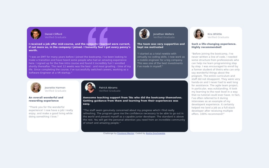
I couldn't figure out what I was doing wrong with the media queries in scss. The website isn't responsive, I tried different things. Could you please guide me and tell me what I'm doing wrong?
Community feedback
- @Yakub-EgamnazarovPosted almost 3 years ago
Hi, congrats. About your responsiveness issue: I think the problem occurs when you just used your media query, you just re-specified grid-template-columns, but didn't specify grid-template-areas for new width. I think, inside the same media query you should also specify grid-template-areas for mobile layout and add media query for each element inside the grid (cells) specifying grid-area. That would help. let me know if you succeed.
Marked as helpful1@anetaanettePosted almost 3 years ago@Yakub-Egamnazarov Thanks a lot! When I tried to use grid-template-areas it didn't work because it told me that there isn't such grid-area's (the cells). I ended up writing grid-area with starting row, column and ending row and column for each cell and it worked. Thanks again :)
0
Please log in to post a comment
Log in with GitHubJoin our Discord community
Join thousands of Frontend Mentor community members taking the challenges, sharing resources, helping each other, and chatting about all things front-end!
Join our Discord
