

Design comparison
SolutionDesign

Community feedback
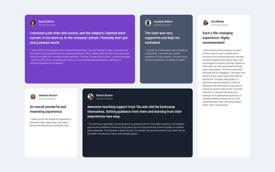
- @VCaramesPosted about 2 years ago
Hey, @GrahamTheobald. Card looks great in mobile view!
Unfortunately, once it begins to expand, your layout begins to begins to create a lot of space in your cards.
I recommend sing CSS Grid with Grid-Template-Areas as it will make things way easier when building the layout and give you full control of it.
Here is how it looks like fully implemented: EXAMPLE
Desktop View Code:
.testimonial-container {
    display: grid;
    grid-template-columns: repeat(4, 1fr);
    grid-template-rows: repeat(2, 1fr);
    grid-template-areas:
      "daniel daniel jonathon kira"
      "jeanette patrick patrick kira";
    gap: 30px;
  }

  .daniel-card {
    grid-area: daniel;
  }
  .jonathan-card {
    grid-area: jonathon;
  }

  .jeanette-card {
    grid-area: jeanette;
  }

  .patrick-card {
    grid-area: patrick;
  }

  .kira-card {
    grid-area: kira;
  }
Happy Coding! 👻🎃
Marked as helpful1

Please log in to post a comment
Log in with GitHub
Join our Discord community
Join thousands of Frontend Mentor community members taking the challenges, sharing resources, helping each other, and chatting about all things front-end!
Join our Discord