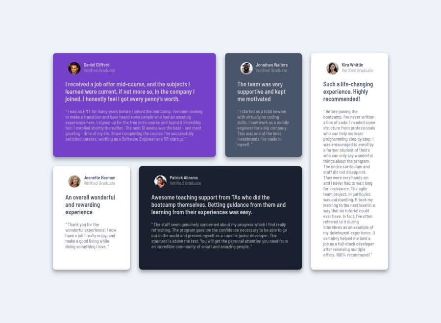
Design comparison
SolutionDesign
Community feedback
- @VCaramesPosted almost 2 years ago
Hey there! 👋 Here are some recommendations for enhancing your code.:
- The profile images are not decorative ❌. Their
alt tagshould not be blank. It should state the person’s full name.
- The headings in your component are being used incorrectly❌. Since the
h1heading can only be used once ⚠️, it is always given to the heading with the highest level of importance. This component has several headings of equal importance, so the best option would be to use anh2heading ✅ since it is reusable and it will give each heading the same level of importance.
- The only headings ⚠️ in this component are the names of each individual; “Daniel Clifford”, “Jonathan Walters”, “Jeanette Harmon”, “Patrick Abrams” and “Kira Whittle”. Everything else should be wrapped in a
paragraphelement.
- For the testimonials, it is best ✅ to to wrap each individual testimonial component in a
figureelement, the individuals information should be wrapped in afigcaptionelement and lastly, the testimonial itself should be wrapped in ablockquoteelement.
Code:
<figure>
   <figcaption></figcaption>
   <blockquote></blockquote>
</figure>
More Info:📚
- Using CSS
gridwithgrid-template-areaswill make things way easier 💯 when building the layout and give you full control of it.
If you have any questions or need further clarification, you can always check out my submission and/or feel free to reach out to me.
Happy Coding! 👾
Marked as helpful0 - The profile images are not decorative ❌. Their
Please log in to post a comment
Log in with GitHubJoin our Discord community
Join thousands of Frontend Mentor community members taking the challenges, sharing resources, helping each other, and chatting about all things front-end!
Join our Discord
